When I first joined as a growth-hacking intern at Oursky, I was tasked with achieving a 40% conversion rate for A/B testing. Only, that was the first time I’d ever heard the term. Our company had just completed the app Shotbot, which helps developers submit screenshots to iTunes Connect in a few clicks. Of course, the next step was to promote it, and I had to learn the science of A/B testing on the job. It took three A/B tests before I hit a 37% conversion rate on Optimizely. In this post, I’m sharing my mistakes and learnings from each of my three trials.
Trial 1 – Changing the tagline only
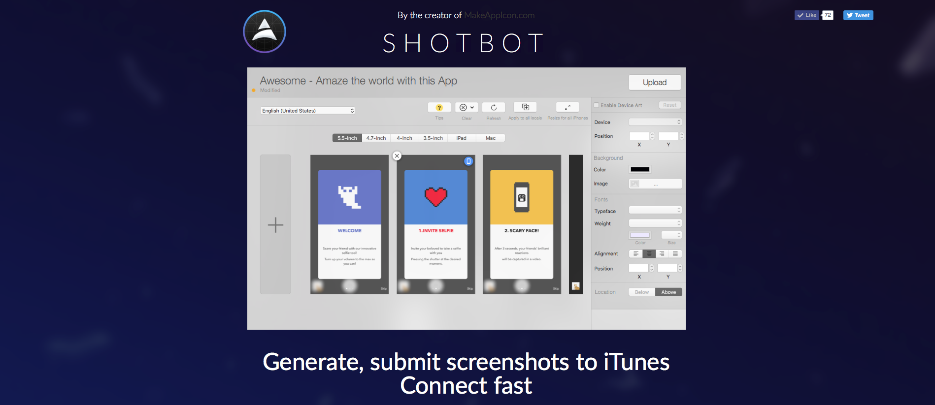
Essentially, my job was to modify our existing landing page for our app, Shotbot to convert users. After doing some research, I decided to change the tagline, which is a summary of the product and our core value proposition.
The benchmark version was ‘Generate, submit screenshots to iTunes Connect fast’. I believed that the tagline was too ambiguous for developers, so I introduced two variants to my first A/B test simultaneously:
- ‘In 3 steps, Generate and submit screenshots to iTunes Connect’ (Variation 1)
- ‘Save you 15 minutes in preparing screenshots for iTunes Connect’. (Variation 2)
For landing page tests, we use Optimizely, a tool that helps non-technical people set up A/B test easily (otherwise, we use Google Analytics). I could use the platform to monitor performance tracking for my new variations.
My first test achieved a 26%-27% conversion rate, which was about the same as the benchmark. However, it was not just that my hypothesis was rejected. I had made mistakes designing the test. For the amount of traffic we were getting, about 200 visits a day, it would take too long to test two variants simultaneously. I should have used one variant to see if the tagline was an issue.
In my first trial, I learned two things: our users didn’t care about the text and, even more importantly, that I hadn’t framed my test well enough to learn which parts of the landing page they did care about and plan my next step. I had focused on one component of the landing page set up a test without having an underlying hypothesis to test.
Trial 2 – Changing Videos to GIFs
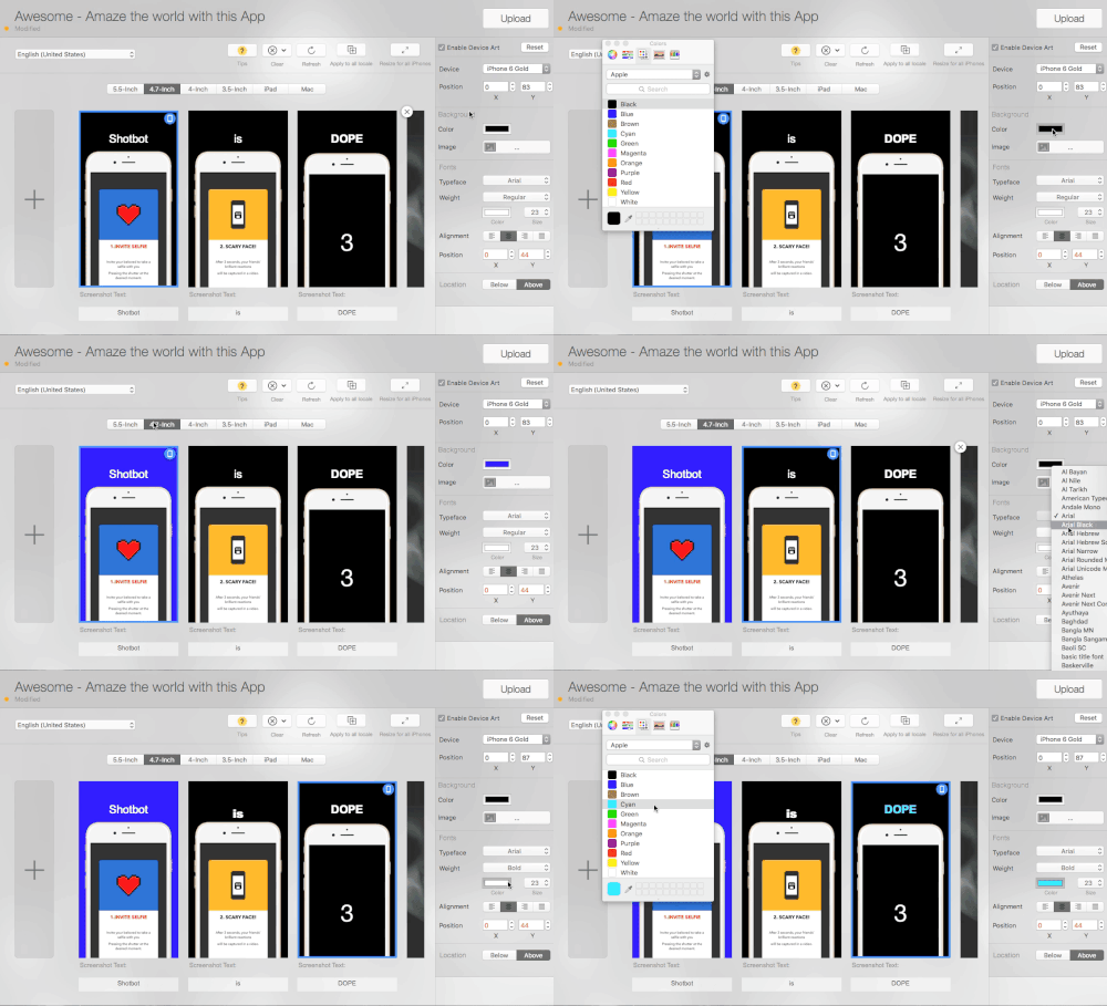
In my second trial, I hypothesized that ‘developers needed to know what they’re going to get to convert’. In principle, this encompasses my first trial with the tagline, but extended other parts of the landing page to test.
For the second A/B test, our baseline-landing page had a video to demonstrate the functionality to visitors and my variation was an animated GIF to save users from clicking. I assumed that site visitors 1) could not figure out what the product was, 2) would have short attention spans, and 3) didn’t want to click on a video.
Surprisingly, the conversion rate for both versions was at around 28%. This basically rejected my hypothesis that developers ‘didn’t know’ or ‘needed to know’ what they were going to get.
Since we were also tracking click-through rates, I was intrigued by another statistic: 80% of converted users still clicked the download button located at the top of our page despite all the information provided in the lower part. This could mean they did not look through the entire page, confirming that the information was not a key decision-making factor.
This lead me to my another thought: that visitors might be impulsive, making split-second decisions, and clicking the download button.
In my next round of testing, I focused on the content above the scroll area. The question was, what content should I modify?
Trial 3 – Adding user’s testimonial
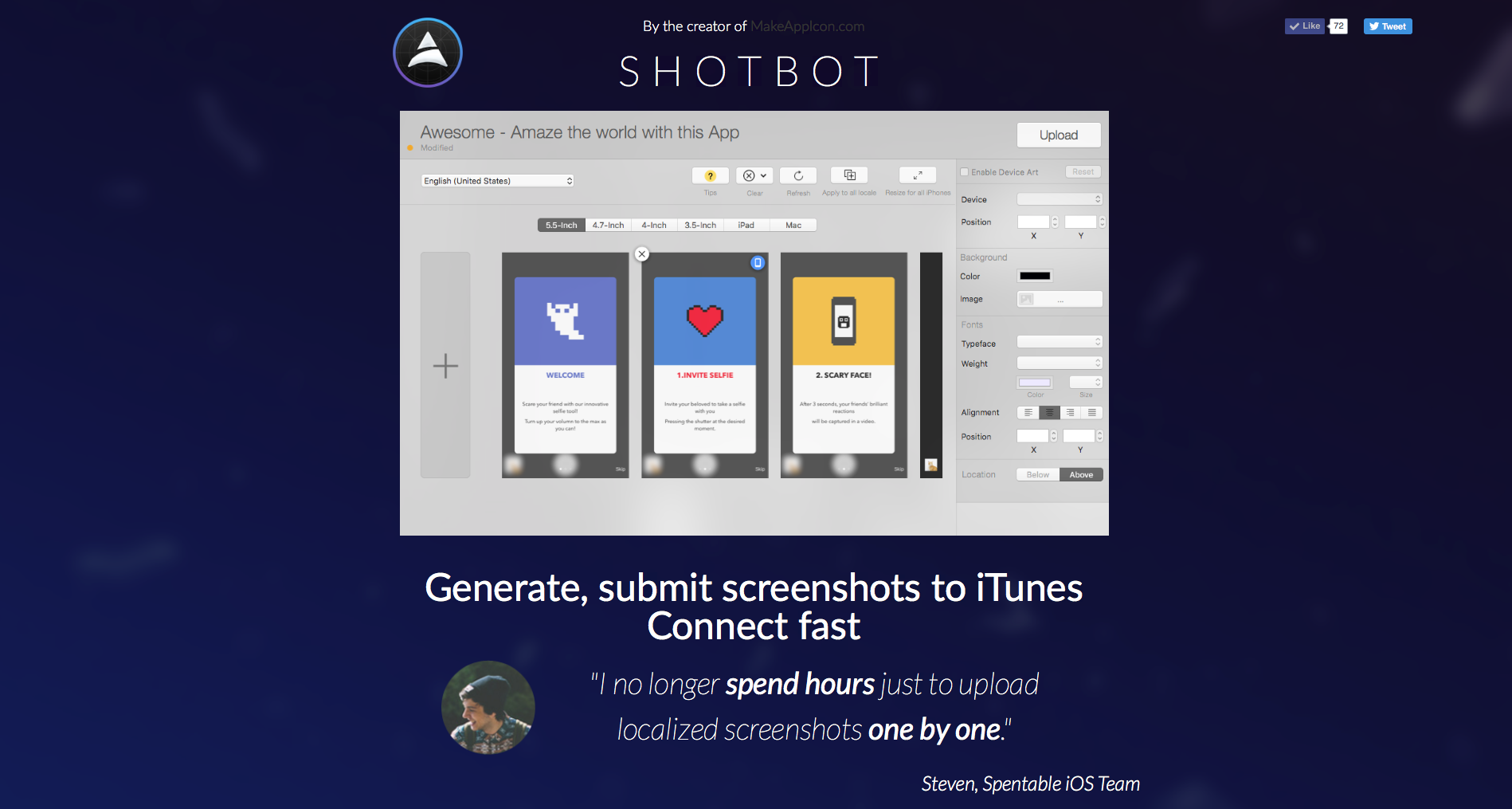
To narrow down all the possible types of text I could fit into main landing section, I hypothesized that ‘developers need social proof from other developers to convert’. I reached out to our users to get some testimonials on how ShotBot had helped them.
In the variant, I chose a testimonial that was succinct and demonstrative. The quote reads: ‘I no longer spend hours just uploading localized screenshots one by one.’ Steven summarized our value in a way that other users could relate to and even quantify.
This small change shot our conversion rate to 37%. The truth coming from a third-party went a long way.
The difference in result between my first and third trials was understanding how to use A/B testing as a framework. It’s a dance between the science of studying user behavior and intuiting what users want. The point of A/B testing is to remind ourselves to think about our users, put ourselves in their shoes, ask good questions, and get solid answers.

The key actually isn’t achieving a target on the first try. If I did, I wouldn’t have even known what I had done correctly or incorrectly. My real luck was having a few failures to learn from, so that I could feel like I owned my success when I achieved it.
Stay tuned for my next article, which covers the major mistakes I made in my first trial.
By the way, check out this Unbounce post on landing page tests.
Have any other user interview tips you’d like to share? Leave us a comment below.
If you find this post interesting, subscribe to our newsletter to get notified about our future posts!
Written by:
Dennis the intern. Doing all sorts of growth hacking, content marketing and data driven goodies at Oursky. He loves cats too.
Find him at dennistam@oursky.com|Linkedin|Twitter

