Where do you start for visual identity? So much meaning is crammed into a name, logo, and 16 x 16 icon. If you want a quick review of some design principles, check this article on effective logo design. Today’s post is a transparent sharing piece on how we developed the toaster logo for an Oursky in-house product, MakeAppIcon.
The first iteration of MakeAppIcon (MAI) was a simple web app that helps users make icons for various platforms. We were sick of resizing, so we created an app that would help us do that. We don’t get too hung up on names, so we just used something people could remember. People remember smart and short, or descriptive and obvious. We went with the latter, and with the name decided, we moved on to visual identity.
Logo magic happens when you let go.
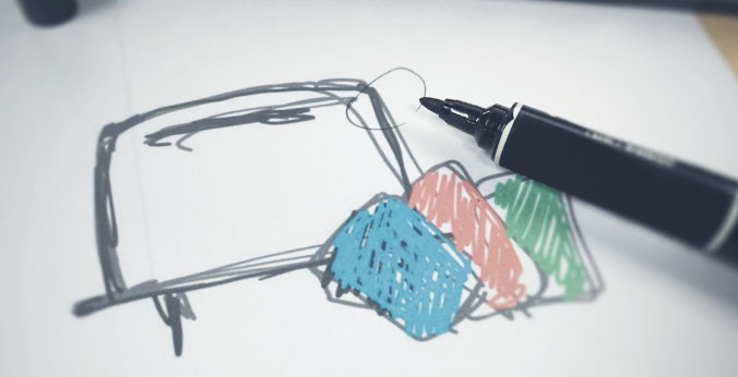
Logos are important, but we also try to take a step back. We do our research, think about appropriate colours (check this colour emotion guide), consider simplicity and all the things an icon should have. Then, we shelve the rules and get out the sketchbook to brainstorm.
At this point, we were thinking about a representative image for our new product, not an icon specifically.
Tip: Think universal items. Think in small shapes (for scalability).
Simple Metaphors
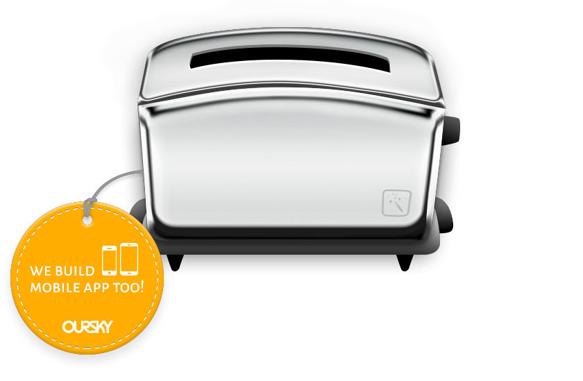
This 3D toaster was what we used for our first web version of MakeAppIcon (MAI). The was that toasters are quick and simple. Our app made icons ready-to-serve too. We went with a polished design to further the ‘simple’ but ‘sleek and professional’ image. Note, this isn’t an icon yet.
One of the best things about the logo was how adaptable the design was. We could slip icons in like a piece of toast. We could also add an ‘Oursky’ badge for soft brand-exposure. Since we’re development firm, we’re always on the lookout for new clients, so being able to build our company brand into this app’s identity came in handy.
Tip: Use textures to convey character. See if your visual image is easy to add components to.
Follow the Trends

In late 2014, flat design was in full swing in the web and mobile app spheres. We decided to go with the times and give our shiny toaster a makeover. Together with a web-app redesign, we also introduced our flattened toaster. This new design also fits in with backgrounds.
Tip: Simple visual identities are easier to reskin with different styles.
Building Out on Visual Components
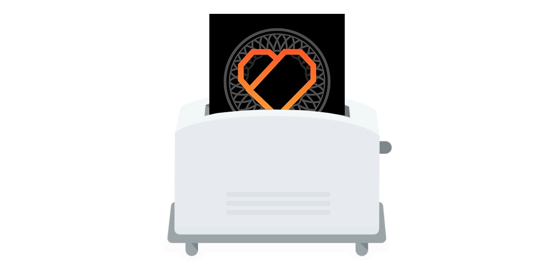
Visual identity is about cohesion. Our original toaster took logos, put them in, and pushed back out the export files. With the flattened look, the inputs looked like cards, so we expanded on the idea and created three colour cards. The cards could also greyscale easily.
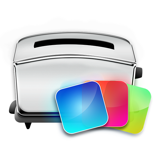
Don’t be afraid to revert.
By February 2016, we wanted to make a native desktop app as well. By then, the toaster had become a recognised symbol for MakeAppIcon , so we sketched the new logo. The desktop icon would incorporate the file cards that slipped into our web app to be toasted. However, we opted for the original glossy look to match better with other Mac icons. We kept the flat logo for our web version.
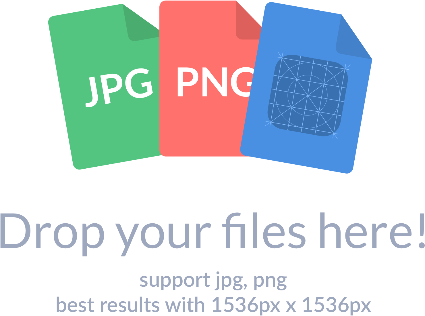
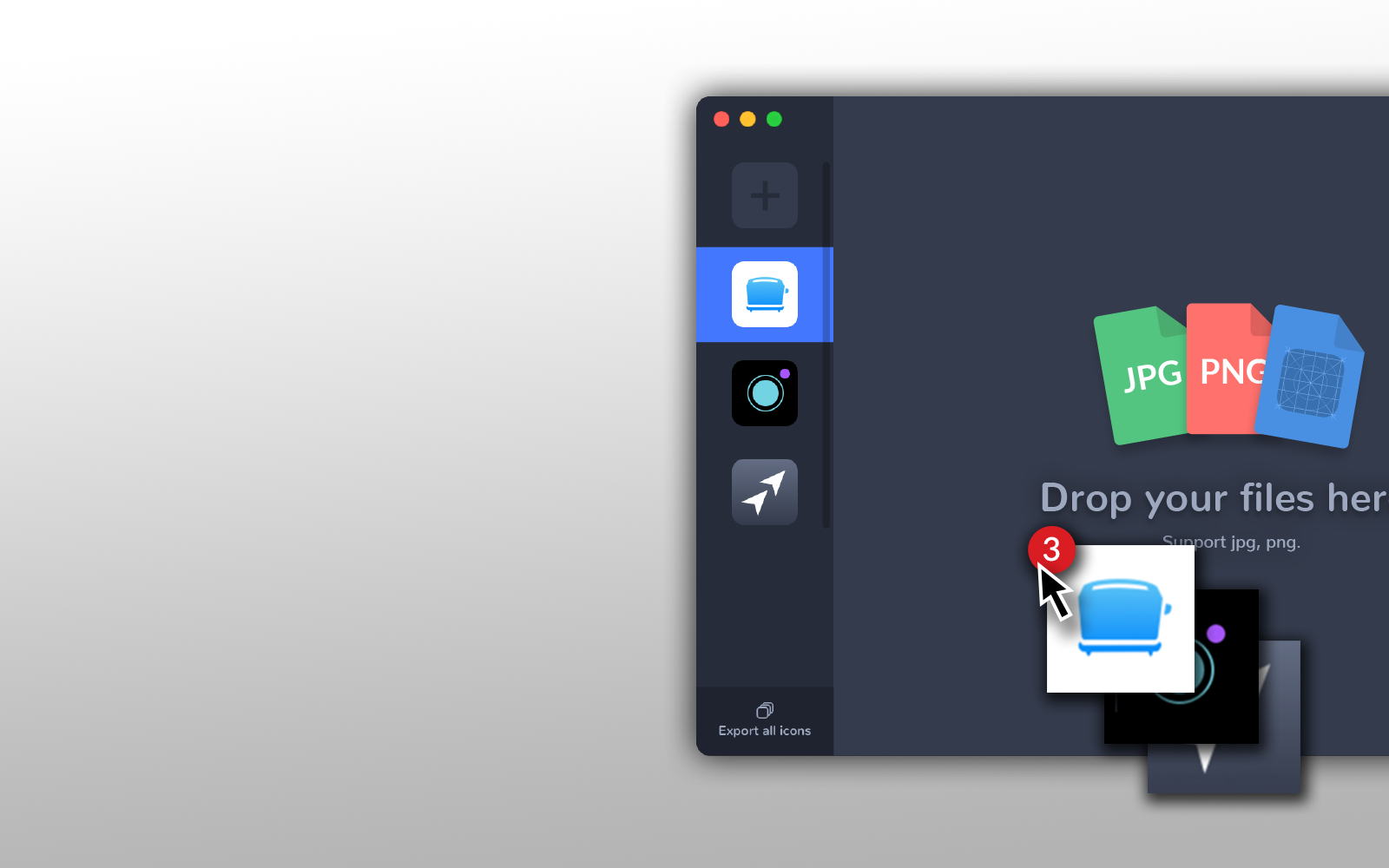
Because we took out the toaster image as the backdrop in our native app landing page, we used the three cards instead. These three cards were also a visual way to tell our users what files they could use.
That’s about it! Of course, it took some time for us to tweak things, so give yourself some time to find your inspiration.
Of course, logo design and UI design are only one part of the product development journey. Whether you’re a developer or designer, be sure to work well with your team!
Also check out a post on front-end UI design essentials for developers from our lead designer, Frank. Since we’re developing our open-source backend service Skygear, we’re also stepping up our game in open-sourcing our methods for product development. Check out our weekly blog posts for more tips.
Better yet, subscribe and bookmark our blog so that we can send you the latest tips on product development, design, and business development when they’re published!

