Have you ever dreamed about random strangers showing up your storefront and walking away a happy customer? In the digital world, that’s called your website. Just like a well-designed store that’s a pleasure to browse through, there can be well-designed websites that are effortless to navigate.
The key to a good site begins with a good wireframe.
Wireframing is a process that helps to design a site that communicates clearly to the audience and gets them to convert to our product. Simply put, an effective wireframe is a design and roadmap to help build a great site. Today, we’re excited to share our wireframing tools with you and get you started!
Mind Mapping for your design
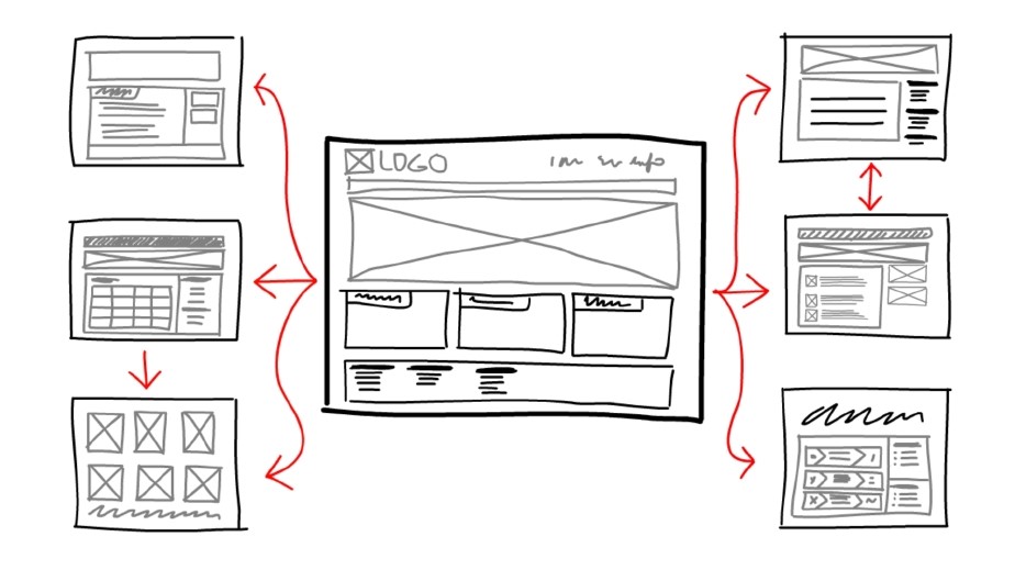
So what’s the first step to good design? Studying.
Before building a site, it’s important to understand what makes a good site layout and navigation flow. Familiarise yourself with site components, and what users would want on their site, and how they want to find it. It’s also easier to build up a visual picture if we have ready examples. Check out some ready-made designs and templates on Quackit and CreativeMarket for inspiration!
Designing your Process
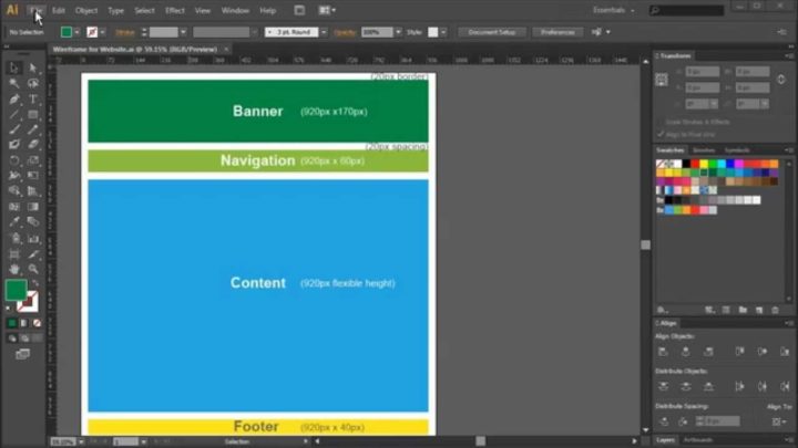
Wireframing is about process, so the first thing is to design your own process. It begins with the overall layout, so that you can map out navigation. Where will people go after they click on the banner? What navigation links are there? What’s in the footer? You will need to create mockups for all of these and test them with potential users. Your first layout like a visual checklist of what you need to do moving forward.
I use Adobe Illustrator for web frame design because of its compatibility with Adobe Photoshop, which I need for visual designs.Adobe Illustrator can generate PSD files, which can be edited in Adobe Photoshop after.
For the HTML code, I use the CSSGrid. If you want to correct mistakes or change your design, Blueprint, saves development time and is good for ensuring consistency across the code.
Pick your Top Tools
Illustrator is great for doing an inital desing. Next, you need to test out your site without actually building everything. That’s the point of the wireframe and high-fidelity mockups (visual test runs without the code). Users care about visuals, whereas developers build from the ground up. To save time, it is easier to show users what we’re planning to make sure we are on the same page before the real work begins. I’ll introduce three user-friendly and powerful wireframing tools below:
1. Balsamiq
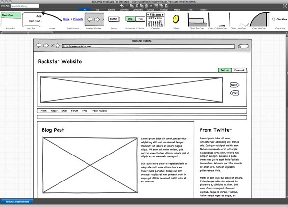
Balsamiq is of the most widely used tooweb framebframe design. It has integrated and native web apps and is optimized for team feedback. It also has extensive tutorials, a community, a library full of components that you can drag and drop easily into your mockups. Basalmiq is your digital, interactive, sketchbook.
2. Atomic

An alternative to Basalmiq’s orientation on process and components is to look for a tool that pays attention to visual design details. Atomic distinguishes itself by allowing designers to make mockups that resemble their visions. Images can be correctly spaced, and event handling and transitions can be adjusted. It is available on for Mac and Windows.
3. Uxpin
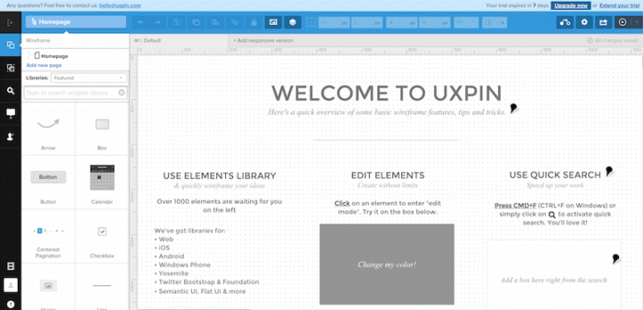
UXPin turns wireframes into high-fidelity mockups. The web-app enables team collaborations, which is great for getting feedback. Once the elements in the wireframe are confirmed, the design elements can be quickly dropped in to create the high-fidelity mockups and prototypes. It is the one-stop design shop.
The most important thing is to test the tools that work for you. There is no best tool – only the best tool for the job.
Setting up your Grid
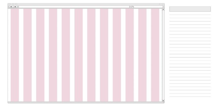
Once you’ve decided on your favourite tools, it’s time to get down to work. I use the CSSGrid to setup grid dimensions. You can choose and select and particular dimensions of your choice. Next is to select the resolution of your wireframe. You can set any value you like. Beginners can just select a resolution of 960 pixels so that your grid appears in the center of your design layout.
Define Layout with Boxes
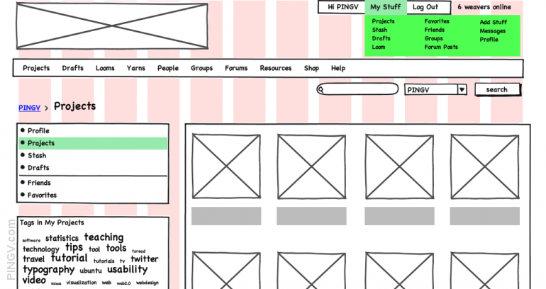
Once the grid has been defined, boxes are made and placed on the grid layout screen. The hierarchy of these boxes should also be kept in mind (starting with the heading on top and gradually with the contacts at the bottom). The dimensions for the components need to be accurate, as that will directly affect your code later on. Sometimes it might be useful if boxes with different dimensions placed side by side to visually see what works. Don’t just plug in 3 because you feel like it. These details will mater later on.
Determine pecking order using the ‘Text Tool’
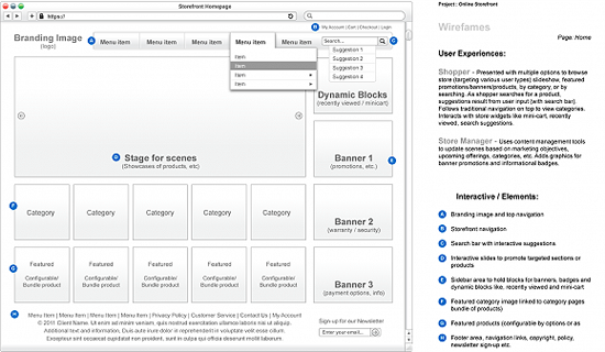
After setting up all boxes, it’s time to fill them with the a descriptive text so people understand what they are looking at. Generally, it is better to start with the label for the box, and a smaller text if it needs a bit of description. Make your formatting consistent in your boxes to be professional. Your wireframes are meant to facilitate, not distract.
Converting Wireframe into a Visual
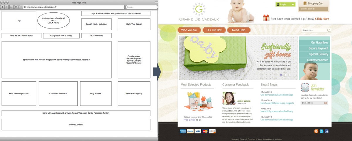
After your wireframe has been approved, you will need to populate the squares with – no, not data – images. If you were creating a file on Illustrator, then save the .psd file and send it over to Photoshop from where the visuals can be plugged in. Adobe Photoshop CS6 and later versions will have this import feature.
That’s the quick and dirty for now! We kept it short because the most important part to wireframing is to play around with the tools yourself and see which platforms are intuitive to you. We’ll be following up with more in-depth pieces in the coming months!
Liked this post? Check out our post on 8 Wireframing Principles for Project Managers.
Have any other user interview tips you’d like to share? Leave us a comment below.
If you find this post interesting, subscribe to our newsletter to get notified about our future posts!







1 comment
Fabulous, what a blog it is! This blog provides useful
facts to us, keep it up.