If clean and maintainable code is at the heart of a great product, an intuitive and seamless user interface and user experience (UI/UX) is the soul. But in order to have great UX, technical considerations must go into the app design. In order to express great mobile app design, development teams must give as much attention to their front-end code as they do to their system architecture.
What is an iterative design process?
At Oursky, we apply an “iterative design process” when wireframing and prototyping mobile apps. It’s a cyclic design process of prototyping, testing, analyzing, and refining the product over time. The main principle behind this approach is to break down the workflows and simplify the design process, which ultimately helps in identifying and addressing issues and flaws in the UI and UX early on, before the app is shipped and launched. So rather than working on an app design from start to finish and in one fell swoop, an iterative design process is incremental and ongoing. The UI/UX is ideated, designed, tested, and built and improved upon in future designs.
We adopt this design process for many of our projects, including everything from enterprise business logistics for utilities companies to consumer internet-of-things (IoT) coloring apps for kids like Coco Color. In this article, we will demonstrate our own app design process.
Wireframing and Prototyping
Before starting development, we work on our UI/UX design work — from wireframe and mockup to clickable prototype — using user stories we collect from potential clients. The format of the user stories vary, but generally, they provide us with a product summary and the things users want to do (e.g., create an account with a mobile number, authenticating the device, etc.).
When we’ve captured what we think the users would want to do through these user stories, we design the product features and do a quick turnaround of creating a wireframe, then a mockup, and finally, an Atomic-based prototype.
Managing Our App Design Workflow
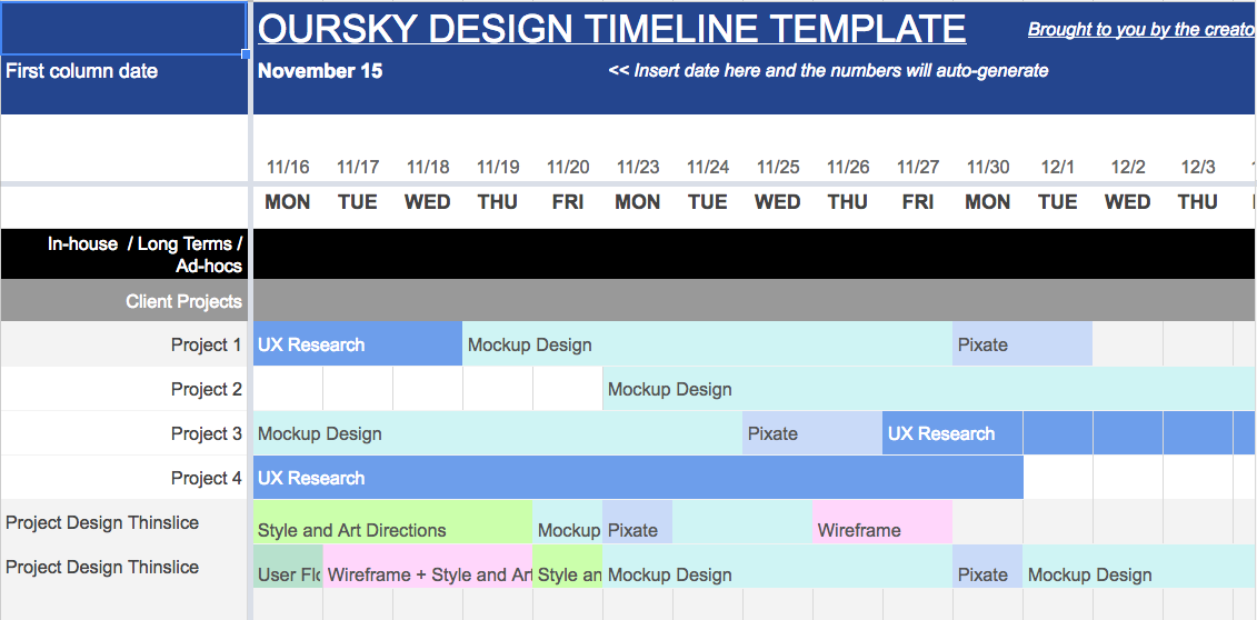
Our design process is typically completed within two to four weeks. All client projects are assigned a PM who will follow a project from design through development (if a client wishes to continue).
Looking at our template (our designers’ schedules with project names removed), the last two timelines are more typical for our projects. Sitemaps / user flows typically take a day or two while wireframes, mockups and prototypes may take a week. As indicated in project 1, 3 and 4, some projects require research, which may take longer.
Creating a User Flow
Our UI/UX design process may begin analogue because we have rooms and whiteboards that we can brainstorm with. After the initial drawings, we create a user flow, which visualizes the paths of a potential user on a mobile app or website to accomplish a task. The sitemap is meant to quickly visualize how a product can serve one of the user stories. We want to make sure everyone is on the same page about the main components and pages of a website or mobile app.
What we do:
- Synthesize the product specifications.
- Conceptualize the user flow of major user stories for the mobile app or website.
Tools of Choice:
- Adobe Illustrator (US$20.99/month as single app)
- Sketch (US$99 one-time payment for personal license)
- Google Draw (free)
What is a wireframe?
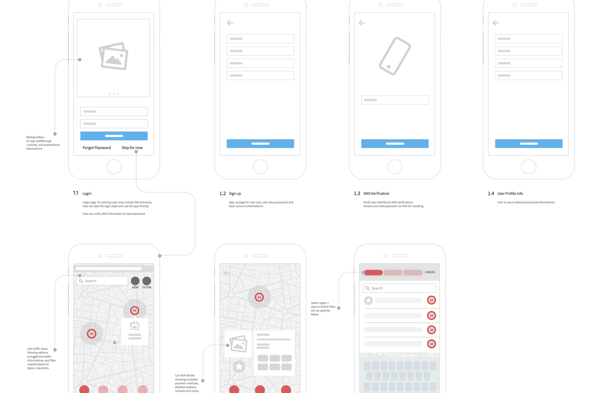
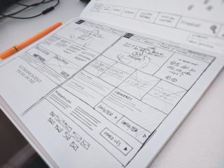
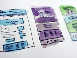
The purpose of the wireframe is to help visualize the front-end features of a product and narrate the user flow. Our UI/UX designers will take rough sketches and create a polished wireframe afterward.
As a best practice, we start with minimal colors in order to focus on the key components in the app design and navigation. Having less colors helps everyone (including the client) focus on discussing the features and navigation, which have implications on later development.
What we do:
- Draft the sections and components in the user flow and sitemap.
- Ensure each user interface/display screen has a clear and consistent layout.
- Figure out the navigation.
- Ensure the UX is usable and easy to understand for target users.
Tools of Choice:
- Sketch (US$99 one-time payment for personal license)
- Figma (free for three projects and two editors; US$12 per editor per month)
Mobile App Design, Style, and Art Direction
After a wireframe is approved, we start working on the details of style and art direction. We discuss with the client what ideas they want to convey with colors (incorporating brand identity, for example) and a mood board, ensuring that they are cohesive with UI elements and branding.
What we do:
- Work on mood boards, color palettes, typography, and UI components, among others.
- Design icons, images, and other assets that suit the style previously discussed with the client.
Tools of Choice:
- Adobe Illustrator (US$20.99/month as single app)
- Paper prototyping (i.e., sketching on paper)
- Sketch (US$99 one-time payment for personal license)
- Figma (free for three projects and two editors; US$12 per editor per month)
Creating UI Elements
The devil is in the details. There are many free UI elements kits you can check out for inspiration. They’re a great place to start, but if you want to stand out as a UI/UX design team, you need to put your own stamp on the product. We also look at other design portfolios and content for inspiration using the Muz.li plugin.
What we do:
- Design UI components in different states.
- Design common layouts, transitions, etc. in the app.
- Create an animated demo to help demonstrate how certain UI elements change states depending on the complexity of the UI elements.
Tools of Choice:
- Sketch (US$99 one-time payment for personal license)
- Invision (free for up to three active users and three documents, or US$7.95 per user per month for cross-collaborative teams)
- Figma (free for three projects and two editors; US$12 per editor per month)
Creating an App Mockup
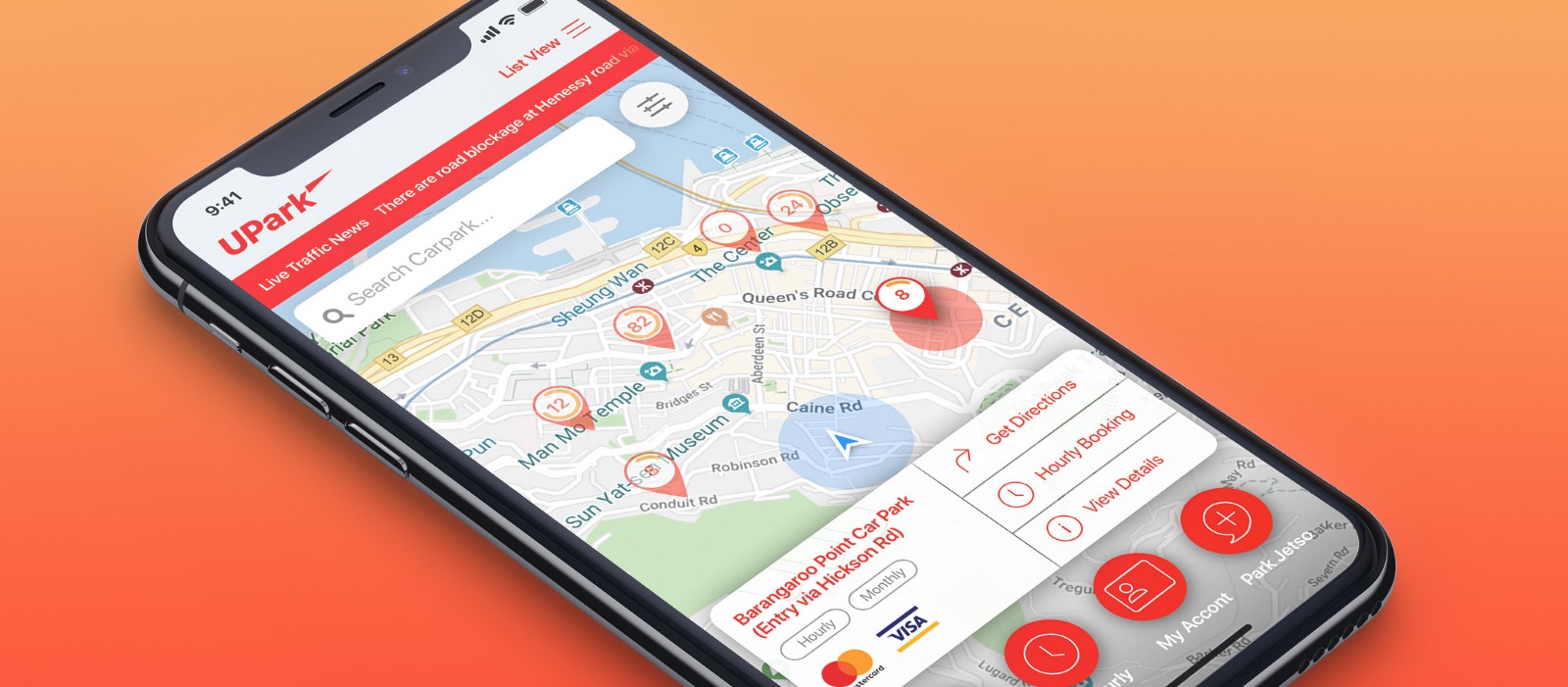
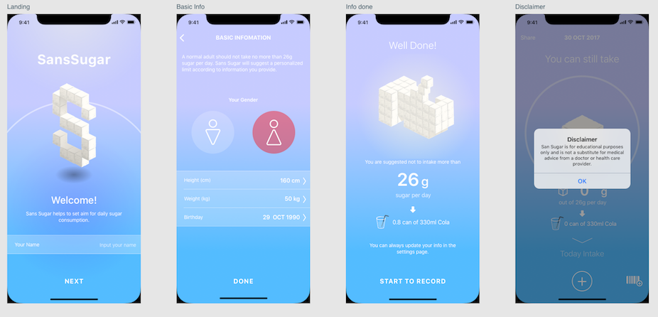
With the color palettes mostly defined, we put them to the test with our mockups. Don’t try to complete all mockups in one go without early feedback from clients or the product manager. We adopt an iterative design process by completing the major screens first then continuing with rest of the screens (like empty states) after receiving feedback. This approach shortens the feedback time and helps clients save unnecessary expenses on major design changes.
Our app mockups are design files that can be exported for development, whether by Oursky’s team or a third-party software development company.
What we do:
- Design illustrations, iconography, images, and UI elements and components.
- Take the wireframe to design site or app mockups with the style and art direction, and UI elements and states confirmed by the client.
Tools of Choice:
- Sketch (US$99 one-time payment for personal license )
- Adobe Photoshop (US$20.99/month as a single app)
- Adobe Illustrator (US$20.99/month as single app)
- Figma (free for three projects and two editors; US$12 per editor per month)
Prototyping: Benefits and Advantages
We create prototypes because they significantly benefit development. High-fidelity prototypes are clickable and show details, such as button and navigation animations, and behave virtually like a real app for testers. Having an example of complex navigations and animations can help developers understand the details of a product and include them in the first iteration of development.
Prototyping also helps entrepreneurs, startup founders, or business executives demonstrate products to investors and stakeholders, conduct usability tests, and gather feedback from their target users in order to get initial validation. Being able to click through a polished app design helps potential users give concrete feedback about details that they appreciate or features they would like to have. Moreover, taking the user feedback and prototype to investors gives them a tangible example, supported by initial responses, that’ll help them better evaluate your pitch.
Tools of choice:
- Atomic (US$19.99/month)
- InVision (free for up to three active users and three documents, or US$7.95 per user per month for cross-collaborative teams)
- Framer.js (US$15/month)
Kick-Off Meeting to Start the App Development Process

Oursky is a bespoke software development agency, providing project consulting, design, and app development services, but sometimes a client may only need an app design. Our goal with design is to hand over mockups (i.e., exportable Sketch or Figma files), with supporting prototypes, user flows, or style guides as appropriate to our clients. These files can be used for development, either by the client’s in-house team, a third-party app development vendor, or Oursky’s own developers.
Many clients also request that we continue with development as well. The earlier a client can confirm interest in development, the earlier we can bring in a developer to advise on the technical complexity of requested features. We design and develop with client budgets in mind and explain the implications behind features for the short and long-term.
What we do:
- Discuss product flow and UI elements and states.
- Resolve any outstanding items.
To reiterate, we do iterations at each stage of our app design process, regularly revisiting each points to improve them and ensure that they best meet the needs of the clients and users. It helps optimize development, as far less time and resources are risked. This puts user experience at the heart of the app design process.
We’re a developer-led company that works with startups and global companies in creating digital experiences and solutions. If you have a UI/UX design project or exploring digital product development solutions, get in touch with us! 😻

