How we started our side project
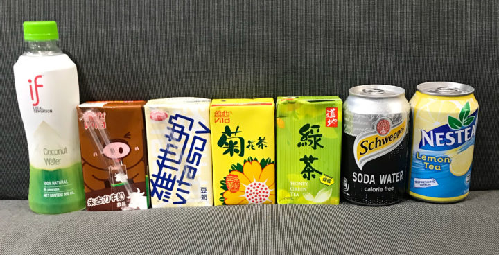
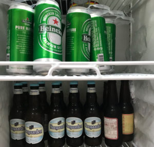
Here’s a first world problem: when you discover your company’s fridge is out of your favourite beverage. Our company’s been offering free drinks and snacks for years and recently we’ve switched to healthier drinks (replacing Coke with Coke Zero, juices with teas, and coconut water). Overall, was it helping? We had no way of knowing. Could we collect data to find out without doing OCD calorie tracking?
Diets have so many factors, but was there one thing we could reduce and make instant gains? Well, based on the recent PBS report on the possible correlation with cancer, sugar was a good candidate. So could we just have an app that would tell us if we were over or under the daily recommended sugar intake limit?
The WHO officially suggests 10% of daily caloric intake, but we opted for 5% as suggested by the Hong Kong Dieticians Association. So, we started another in-house side project like our IoT door lock which was featured on freeCodeCamp. This one we’re calling Sans Sugar.
Our own user story
When we develop products for clients and other developers, we create user stories. So here’s the one for this app (in future posts we’ll share the different stages of product development):
A user can:
1. Sign up / by e-mail (Because we wanted test our Skygear Auth. Usually not necessary for simple app.)
2. Input basic biometric information (to calculate their daily intake)
3. See their daily quota (home screen after signup). Daily quota updates after scanning packaged food consumed.
4. Scan packaged foods for sugar content.
5. Manually input food item and sugar content.
6. See their daily history (whether they stayed within limit).
7. Update biometric information (with an updated daily quota). (We later removed this from our MVP)
We weren’t setting diet goals for ourselves. We also aren’t looking to completely change our lifestyle. We wanted a product that fitted our casual approach to sugar intake.
We tried other apps first
Always check to see if someone else has solved your problem already. We went to the Android and Apple Stores to find similar apps. The apps fell into two categories: calorie trackers for weight watchers and sugar intake trackers for diabetes. On the surface, our sugar intake app might overlap with these apps, so we tried them out to see if they solved our problem.
Solving different problems
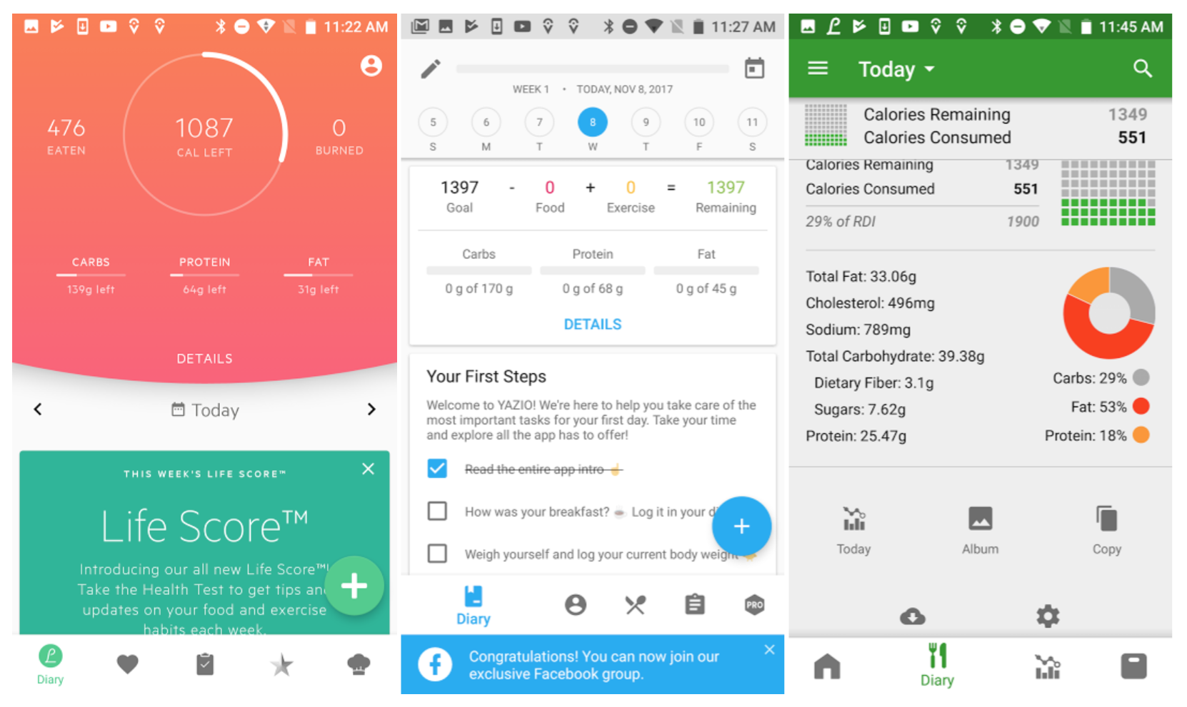
We quickly learned that intake apps are not all the same. If they did cover our use case, they would have been competitors. But we quickly discovered they couldn’t solve our problem. Below is why.
The most popular calorie intake trackers have sleek interfaces, large food databases, and sophisticated nutrient intake interfaces. These details can be important to their users, but the interface is too complicated for tracking one item and only works if you input all intake (too OCD for us). In fact, the interface is misleading for our use case because we only want to input sugar. Consuming 25 grams of sugar is only 97 calories. It will seem like we aren’t eating enough every day!
These apps are solving the problem of balancing a whole diet. We want to solve the problem of staying under one quota. Understanding the difference in the core problem has huge implications for the MVP and user experience (UX) and user interface (UI) design.
Ease of use depends on use case
The purpose of an MVP is to validate a user need. Because the MVP is barebones, it should have just enough essential features that the main target user would want. Also, the project team must understand the behaviour of the target users well enough to prioritize features that create a smooth user experience (UX).
Our hypothesis is that our target users (like us) want an interface that is easy to access, read, and input data. Because the other tracker apps we looked at were based on three meals a day, a user is required to click through several screens or search for their food items.
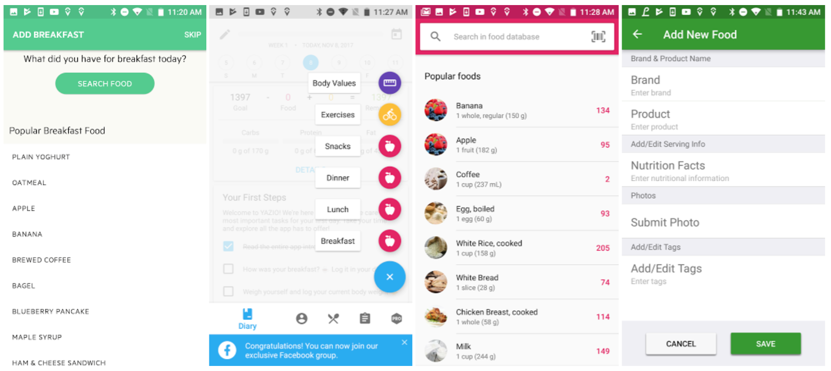
In contrast, we wanted to keep our MVP simple to only do the the following:
- use publicly accessible food data to focus efforts on validation, not creating a database
- focus on the key feature and remove as many screens as possible
For an MVP focused on sugar intake, we started on one type of product that had high levels of sugar and a convenient database to access: packaged products with barcodes to scan.
Because we relied on barcode scanning, we didn’t have to build our database from scratch and could instead focus on the UX and UI.
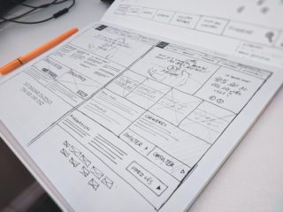
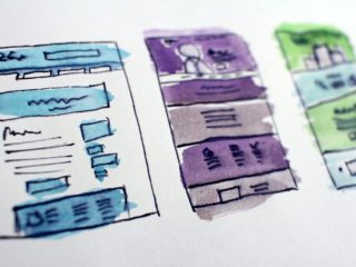
Below was our first wireframe:
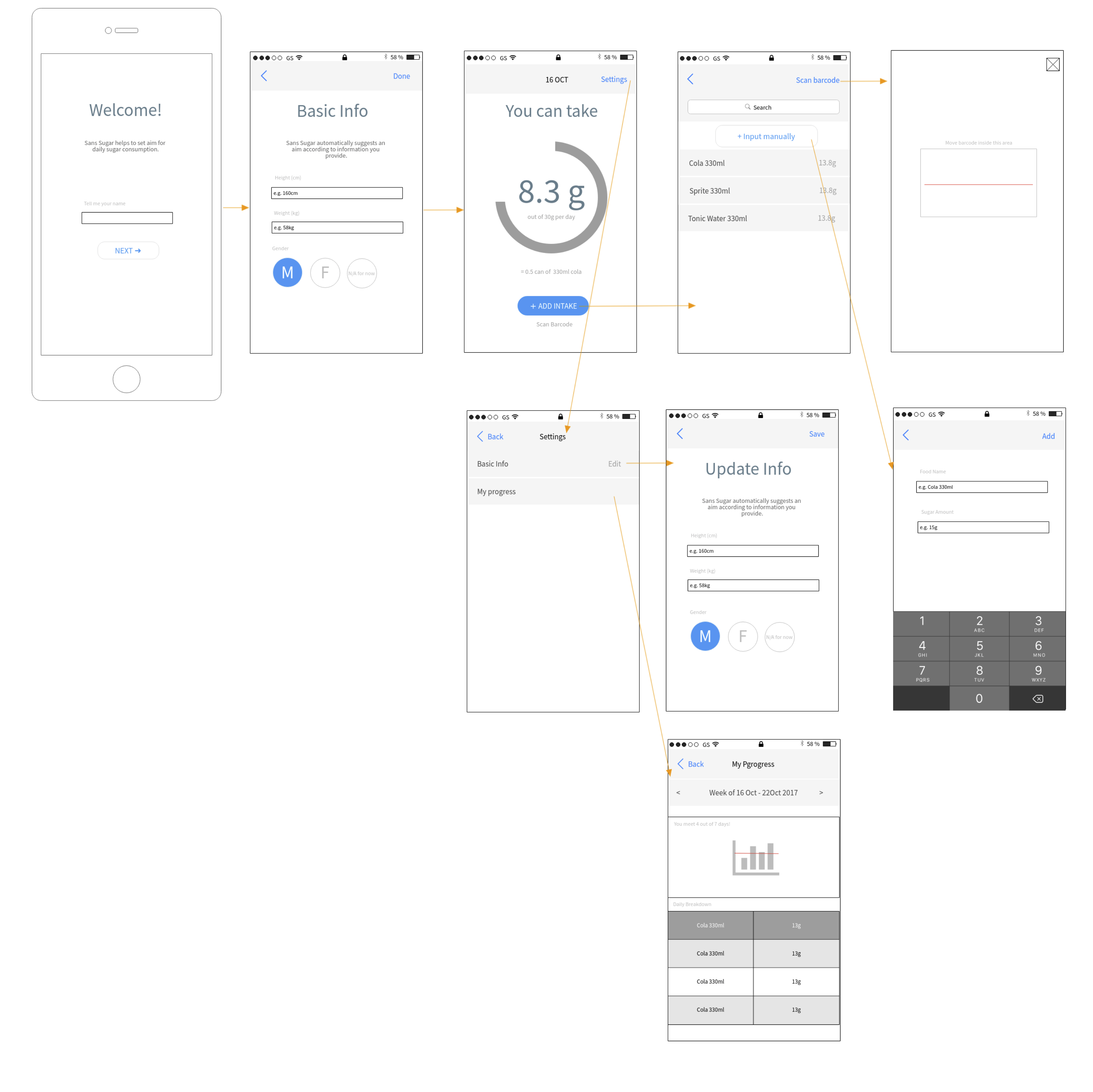
One hypothesis is that adoption was related to convenience. We emphasized barcode scanning to reduce the amount of work a user needed to do. They wouldn’t have the risk of names not matching in searches.
We also wanted to give users the option to manually add in items they could not find and contribute to a growing database.
The other key feature is the actual tracking. We showed the number an individual had taken in that day and a circle to visually show the percentage. This would make it easy for a user to quickly glance and see their latest status.
The non-technical team members looked at the wireframe and gave feedback. Four considerations were raised:
- A disclaimer because it’s a side project, not a health service.
- Gamification features to encourage staying under the limit (showing a streak).
- Including options for users with diabetes or high blood pressure and calculating that intake quota.
- Registration completion screen (a state).
Our V2 reflected these suggestions.
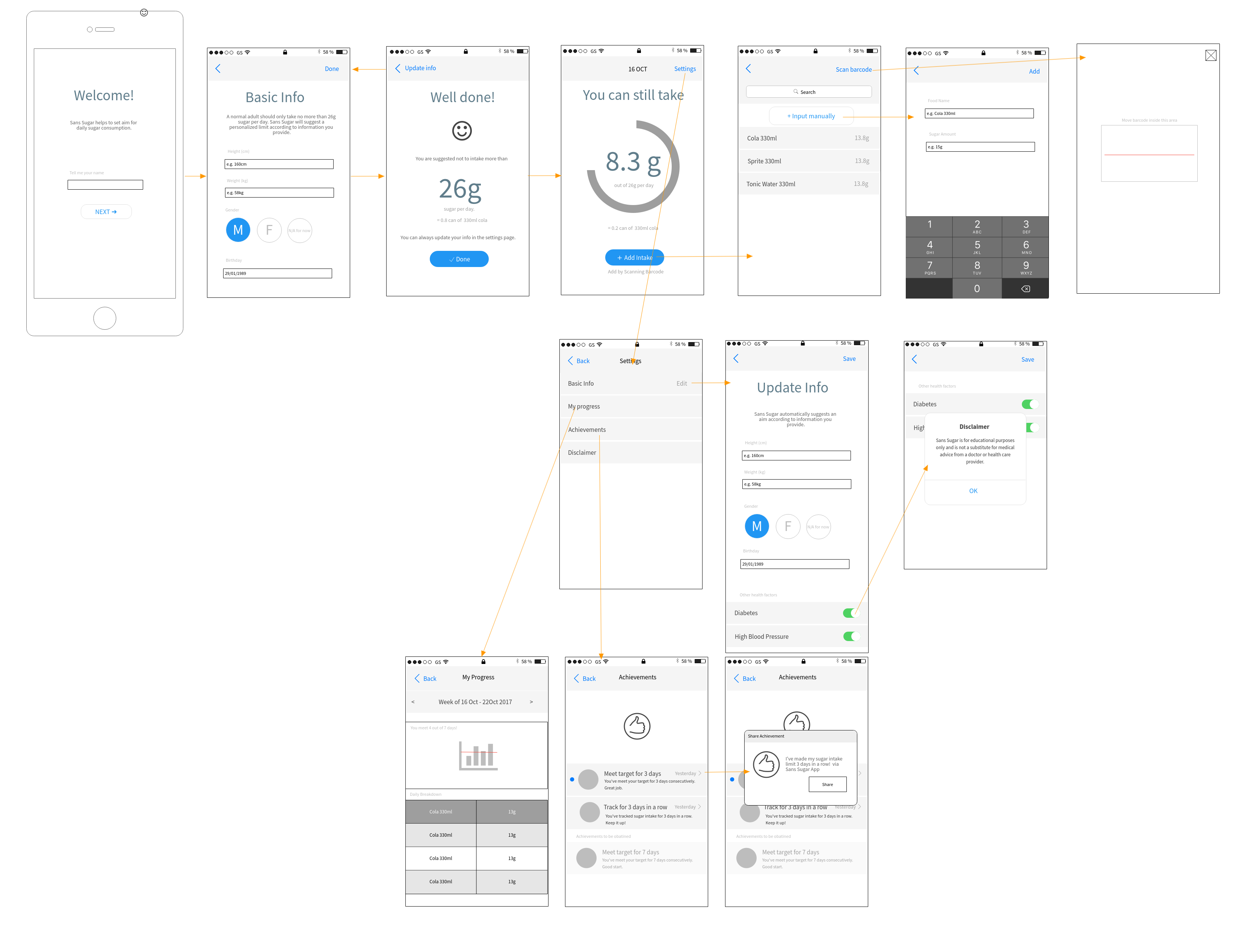
We took this expanded version and asked ourselves again what we could cut. Because we wanted to complete the prototype in one week, we wanted to spend effort only on the minimum and essential features for this MVP.
These were the things we removed:
- Diabetes and high blood pressure options (to focus on 1 target “average” user first)
- Additional gamification screens (could simplify the history screen to achieve the same result)
- Settings and update info screens because they aren’t essential for an MVP
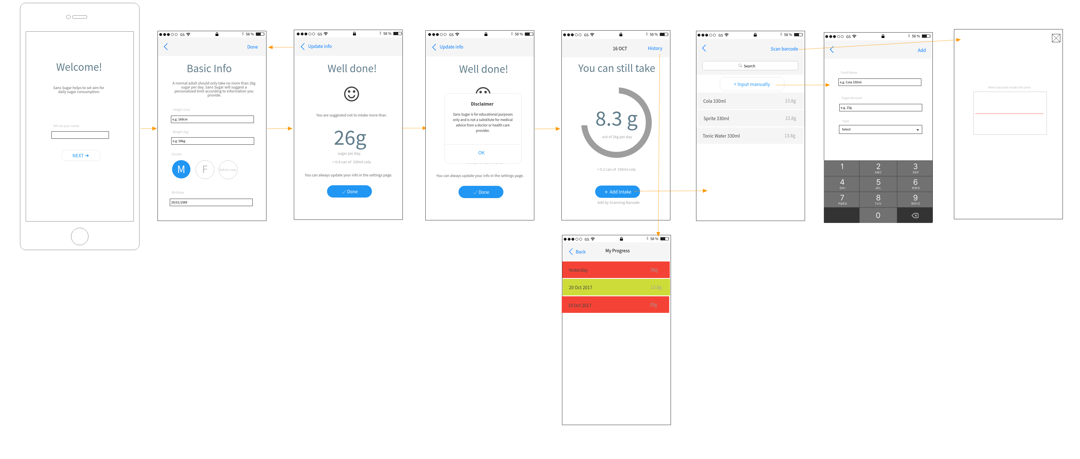
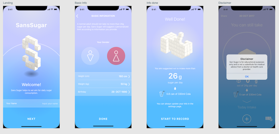
On the surface, V3 looks similar to V1 because we still have 9 screens, but notice the following changes:
- We’ve moved the disclaimer to a pop-up after registration rather than hiding it in the Settings section.
- The “history” button now leads to a simplified “My Progress” screen that uses colours to quickly indicate whether we’re staying within limit. Notice we removed the graphs which may look more impressive, but don’t really mean much because we’re not actually tracking someone’s overall health.
We’ve rearranged our wireframe to make the flow more obvious than the first version. This makes it easier for everyone — from designers, to developers to understand the user flow.
This is Part 1 of our iOS MVP design and development series for our side project, Sans Sugar, a simple tracker for your daily sugar intake. Check out Part 2: from wireframes to mockups.

*If you found this piece helpful, give us some claps or follow the Oursky Publication for more startup/entrepreneurship/project management/app dev/design hacks! *👏
😻 At Oursky we’re all about helping brands and entrepreneurs make their ideas happen. Get in touch if you’re looking for a partner to help build your next digital product.


