Why would anyone care about a barebones wireframe? Because basic layouts can help you demonstrate your competency to potential clients. Oursky’s working relationship with a client begins with understanding the problem they want to work and developing a user story. We share our early designs in the conversation to demonstrate our working style before they make their decision. This small investment builds trust with potential clients, helps secure contracts, and begins great working relationships. The best part is, everyone can create a wireframe.
Some caveats: For pitching app ideas to investors, we recommend that you create high-fidelity mockups or interactive prototypes. You’ll most likely need the help of good designers. But if your immediate goal is to quickly gather feedback from potential customers and tech advice from software developers, wireframing is your perfect starting point. Wireframes can do the job very well at communicating your app idea at the initial stages.
Wireframing is something we do for our own digital products. For example, we created a wireframe for the dashboard of Authgear, our authentication as a service. At the time, our product manager (PM) wanted to assess the technical feasibility of the features we want to include in Authgear’s dashboard. Our PM worked on quickly creating a wireframe for the dashboard before even reaching out to designers to create a full-blown mockup. That way, he saved development time and resources that could’ve been otherwise used to other projects.

What is a wireframe?
A wireframe is skeletal outline and representation of a website or app design. A wireframe provides an overview of the site or app’s page structure, layout, user interface (UI), user flow, and intended or planned functionalities, features, or behaviors.
A wireframe is basic and raw, representing the initial principles and concepts behind the digital product, site, or app, which means the graphics are pared-down. A wireframe is meant to express the main ideas and help your development team, stakeholder, or investor better and visually understand your idea or project.
Why Wireframing is Important
Wireframing serves various purposes:
- Allow your to visually present and communicate your ideas to your potential clients and stakeholders
- Enable you to solicit feedback from users and brainstorm ideas with designers and developers
- Help you start conversations and pitch your ideas to app investors
Creating a wireframe diagram enables your team to better gauge the resources you’ll need and allocate for each functionality in the site or app, drawing you a bigger picture of how the elements connect and work with each other.
Below, we’ll share with you the basics to get you started (including a few tools and frameworks): how a wireframe looks, the features it includes, and what it can do. Whether you are building a mobile, desktop, or web app, creating a wireframe is a good reference point for your client and you to communicate on your future digital product.
Wireframing vs. Prototyping: What’s the difference?
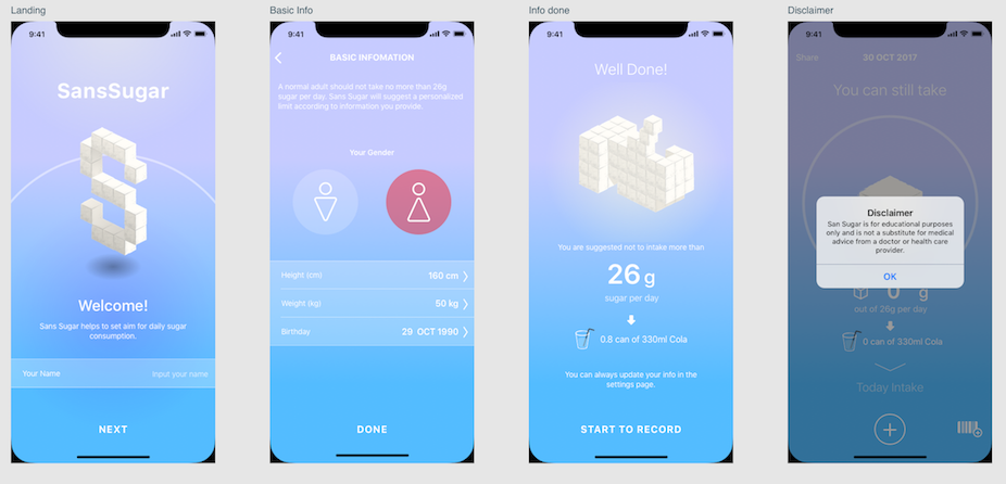
First, let’s clarify what a wireframe, mockup, and prototype are. Generally, they go from lowest fidelity to highest fidelity. Another way to tell them apart is how much color there is. A wireframe is usually black and white (focused on the general idea); a mockup may have some initial colours; and a prototype can feel like a complete app with click-through functionalities.
For comparison, a prototype is a high-fidelity and typically high-fidelity visualization of the final digital product. A prototype simulates user interaction by including clickable functionalities, animations, and other interactive components that allow users (or stakeholders) to experience the content of the site or app. It may look like the finished product, but not yet tied to the back end. Prototyping involves playing with your ideas and fine-tuning them through feedback that will, in turn, shape the final app design before beginning development.
On the other hand, a mockup is a medium- or high-fidelity visualization that shows what the site or app will look like or how they’ll behave. For example, an app mockup can involve a hand-drawn, bitmapped, and static to semi-functional UI design. While a wireframe visualizes the structure, a mockup helps map out content and pin down the site or app’s visual identity — colors, iconography, and typography, to name a few. There are several free/open-source and proprietary UX and app design tools you can use to create wireframes, mockups, and prototypes. These include Moqups, MockFlow, Balsamiq Cloud, Pencil Project, the Sketch wireframe kit, and Figma, although many still do paper prototyping when working on an app design or conducting usability testing.
Wireframe Examples for Mobile Apps and Websites
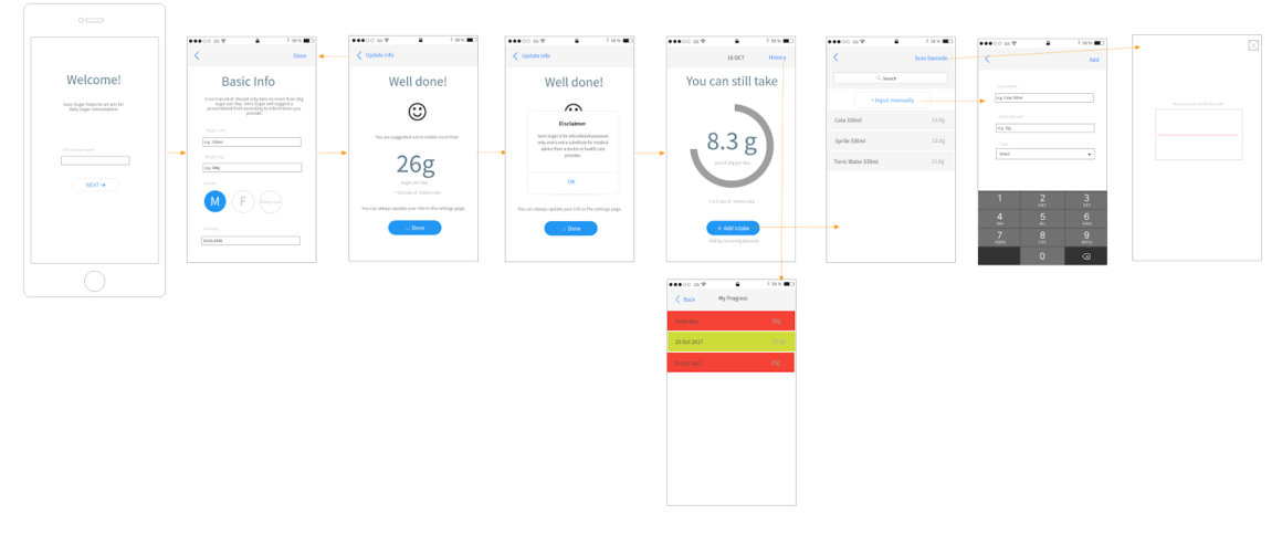
Essentially, a wireframe acts as a blueprint to convey a product’s main features and serves as a visual roadmap that saves everyone time, effort, and money in all stages of development. Wireframing typically includes such things as:
- Creating the input fields (buttons, text areas, image frames, etc.)
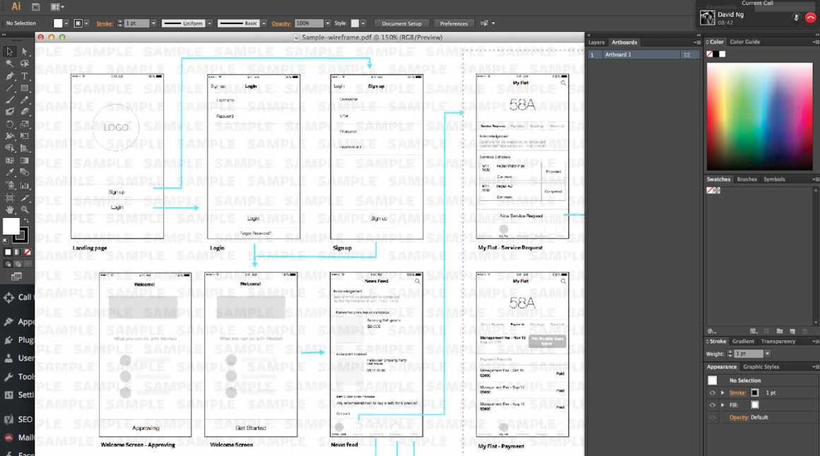
- Drawing navigation arrows (what leads to what/results in what)
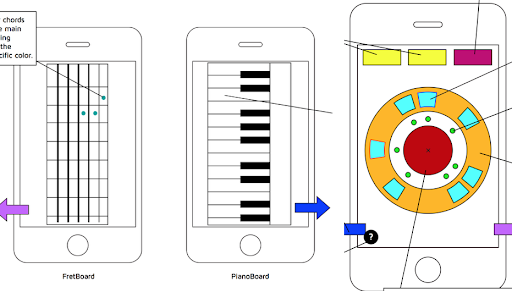
- Sketching notes to specify any features/navigation that aren’t self-explanatory
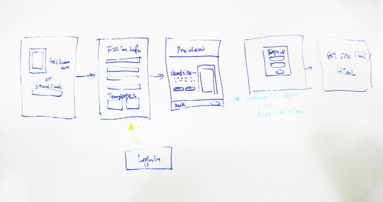
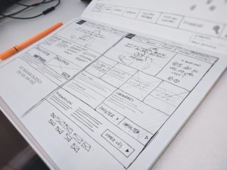
To put it simply, wireframing may not focus on specific details like the button shape or how big each section is. Rather, the key purpose is to roughly make sure everything that needs to be built and integrated is included and visible to the client. For reference, check out these 40 free wireframe templates, as well as our own guide on how to create a wireframe diagram. Oursky’s tools of choice are Sketch and Figma, but the process can begin with pen and paper — even right in your client meeting.
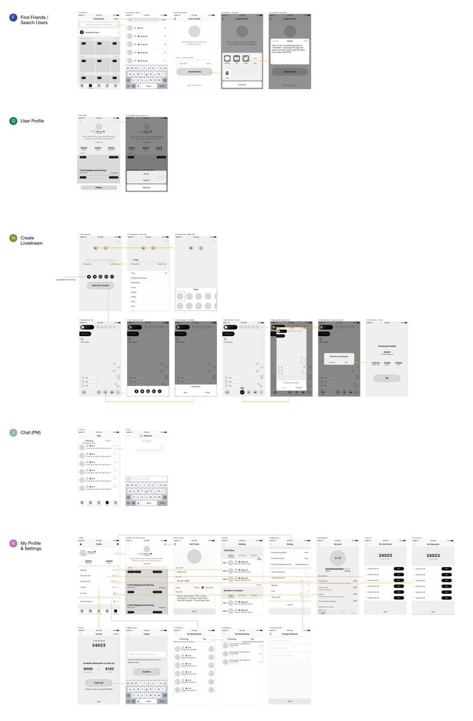
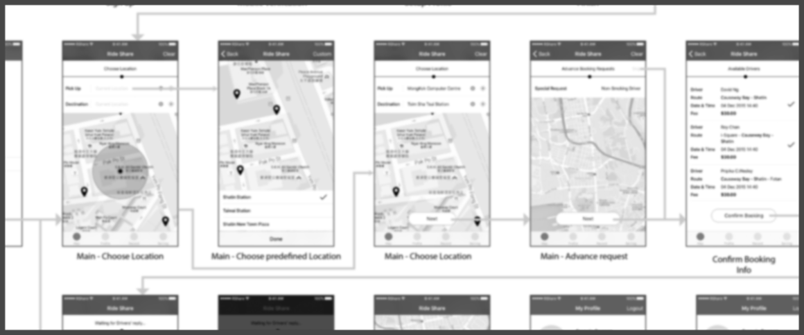
To give you a better idea of what wireframing is, below are wireframe examples we’ve created for various clients and side projects, including a mobile app wireframe:



How Wireframing Complements Navigation Design
For developers and designers, wireframing helps people spot potential flaws or missing elements much earlier and thus save countless hours of potentially wasted time for developers and designers. For clients, requests for changes can be made before development begins, ensuring that everything remains within the project budget as things progress. Showcasing a wireframe diagram consisting of 40+ slides or frames to your client who originally imagined their product to take no more than, say, 10 frames can be incredibly helpful in helping them understand the scope of their product.
While it’s great to know what a wireframe can do for both developer and client, how to build one is perhaps more important. Below are some main elements of a well-designed wireframe.
Navigation design is how a product flows. Where is a user taken to after pressing the “next” button? Navigation in a wireframe shows the relationship between pages, usually by drawing arrows from one page (or better, one specific button) to the next page. Navigation systems can be broken down into global navigation of the overall product, local navigation on the screen, and other types of navigation such as contextual and supplemental navigation. A useful navigation design typically includes:
- Current locator (where will a user go as a result of their action)
- Trace route (how can users get back to where they came from)
- Navigation method (where on a website/in a product users can go)
A strong app design should be intuitive and usable (i.e., accesses the functions that you’ve put into the product). Note that ‘intuitive’ is sometimes cultural, particularly when you get to the graphical user interface (GUI), which includes such visual components as windows, icons, and menus. A basic user interface can include:
- Simple boxes
- Placeholder images
- Form controls
- Icons
- User languages
Wireframing Best Practices
Prioritize function over form. A common mistake is to believe that a good-looking wireframe is better by default. More important than appearance, however, is function. Wireframes are not just boxes, labels, and general arrows. Above anything else, a wireframe should be clear and detailed in stating the functionalities and basic flows of a product. Specific visual details (i.e., color) typically come much later, usually when constructing the mock-up and/or prototype.
Detailed explanations of functions, features, and maybe even tools will often be included on the side (outside the drawn screen). The more detailed these notes are, the easier the checklist is when developing the product. These descriptions, which are linked to the visual features you’ve drawn and functions you want, will probably also indicate the tools you choose to build your apps. What APIs will you need? How will your content management system (CMS) be structured?
Asking too much for feedback is better than asking too little. A feedback loop, or process, between you and your client ensures that the product evolves as accurately as possible. By involving your clients from start to finish, not only will your clients be more likely to choose you, they will also be more understanding of your challenges as they develop.
We’ve worked with many startups and brands in creating wireframes, prototypes, and mockups that helped them win clients and investors. We bring ideas to life with the right blend of technology — from MVP development to scalable digital products. Schedule a no-commitment consultation with us and we can explore how to creatively build blueprints that will solve your users’ needs.
For more startup, dev, design, and business hacks, subscribe to our newsletter! 💚





1 comment
Great to come to your site as the information shared is good and is explained in simple words. Good stuff you are created, thank you for sharing a nice article.