Remarks: This is a rewrite from Jim, a Project Manager from Oursky, sharing at MOPCON 2020 (Mobile Open Platform Conference) about how we can as a developer increase our social engagement and make the world a better place.
I’ll tell the story of a website we built for a client last year, which sustained over more than 17 million page views from 2 million unique visitors in one night — with just one small application server instance on Google’s Cloud platform. We did it without a single crash, and ended up with a small bill of HK$3,000, or about NT$12,000.
I’d like to give a bit more background information first — about me, about the project, and how this is related to “social engagement.”

I’m not a very technical person in the sense that I didn’t graduate from a technical major like computer science or computer engineering. I tried to learn programming just a few months before my graduation for two reasons. I watched the movie Social Network and thought I can build the next Facebook and be rich. More importantly, I studied Humanities and Communication, and I probably couldn’t survive with the salary of a reporter. LOL
My Role as Project Manager
Some developers might not even know what project managers or PMs do in general. It’s like, programmers do all the actual work anyway, right?
Now, as a PM, I consider my primary duty to be working out the requirements and specs with the client and the team. That means telling the clients what can be built, what might be too expensive to build, and what doesn’t make sense, then tell the developers that we did our best to filter out the nonsense but here is what the client requested.
But that’s just the basic. I think there is more to my job that I tasked myself with — to think on the others’ behalf. By others, I mean the clients, the development team, and also, the users.
That ‘thinking’ doesn’t stop at pointing out what features should be built to achieve the client’s goal, or showing how the user experience (UX) and design should be so that the users are not confused.
It’s also about protecting the stakeholders — protecting the client’s budget so building it doesn’t break the bank; protecting the development team’s time so they can focus at code; and also protecting the users’ privacy and interests.
It’s about telling the client no when they ask you to build a backdoor in the app or track and collect all the personal information of your users.
We might not always realize this, but in a computer program, the developers decide what to show to the users. That means that users don’t always know if the quiz they’re taking on Facebook also means that they’re handing in their whole friend list to a company that will use that data to manipulate the election.
What’s happening behind the click of a button is so implicit. It is up to us, the ones who build these applications, to be conscious about what we’re building. That is what I meant when I said we need to think on the users’ behalf.
In an increasingly automated world, you’d probably want the developers who wrote the autopilot program of a self-driving car think more than just how to make the car run, but also other things like what’s in the car and on the road, like humans.
Now that’s a bit out of the scope of the project I promised to talk about and I guarantee you the client we worked with didn’t plan on invading anyone’s privacy. It was just an example of how I took the users’ interest into account when planning a project. But now, today’s topic is actually about the other side of the story — it’s about how we worked around the limitation of the client’s budget and tight delivery schedule, and built a rather successful product.
What We Built: A Website for the 2019 District Council Election
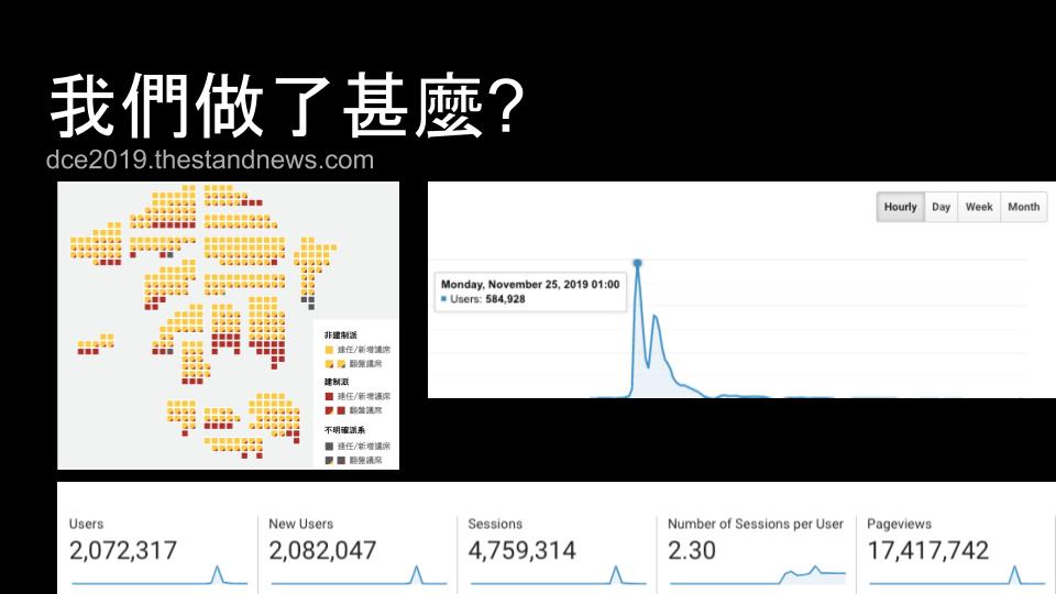
So what exactly did we build — and how successful was it?
This website is what we built. Apart from building a rather efficient website, the design was also praised by some for its simplicity and efficiency.
If this looks strange to you, this chart is a pixelated version of Hong Kong’s map, and it’s a site that our client Stand News (立場新聞), built for the 2019 district council election.
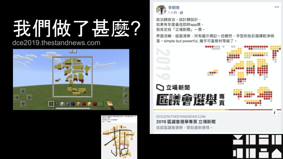
For those who aren’t familiar with Stand News, it is a prominent pro-democractic online media in Hong Kong. We had the honor of working with them for several years now. We help maintain their online services, and from time to time — based on what major events are happening in Hong Kong — build specific memorial or informational sites for them.
Now, elections in Hong Kong are one of the events that Stand News always works with us to build a dedicated site for. It’s not their first, and it’s not our first either, but what made this special is the unprecedented attention it attracted, because of its timing and what’s been happening in Hong Kong at the time.
The Anti-Extradition Law Protest and the Siege of PolyU
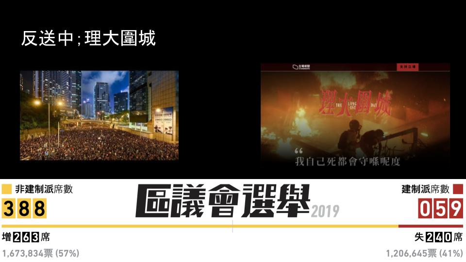
Maybe it’s hard to imagine now. After all, the news you’re hearing about nowadays are the large-scale protests, but Hong Kong people used to be an obedient bunch who mostly just keep to their own business — working their jobs, paying the bills, not caring about politics and the government.
But when the government attempted to pass the new extradition law last summer, things changed. If you want to know more about what turned the obedient Hong Kong people into a protesting crowd, you may go to this website that contains a list of URLs that will help explain the whole incident in more detail.
The situation in Hong Kong around the time of the election was like these:
- People had been protesting against the government every week, or even every day since early June. That meant countless heated protests in Hong Kong in about half a year before the election. As the protests and suppressions became more and more violent, the society became rather divided. There is the Yellow camp that supports the protests and raised five demands to the government; and then there is the Blue camp that supports the government and the police’s suppression of the protests and protestors.
- The restriction on public gatherings tightened, and the police started to search the university campus for evidence of the students’ participation in the protests. The protestors flocked to the campus being searched and resisted the police’s entry into the campus. These eventually resulted in the siege of the Chinese University of Hong Kong and the Polytechnic University of Hong Kong. In fact, a large number of protestors were surrounded and cornered in the PolyU campus before and during the election day.
- I talked about how passive the Hong Kong people used to be. Case in point: Many districts in Hong Kong were actually controlled by pro-government councilors, with many districts not even requiring an election because there is only one candidate from the pro-government parties. But last year, after so many protests, some people swore for changes, and one of those changes included many first-time candidates in the district council election.
The election itself is only for the district councils, which has very little impact on the government’s ruling. But with tension that kept building up within the society, the ongoing siege of the universities, and the pro-democracy camp preparing for a fight in the election, people are actually caring about the election this time around.
The Challenges

Of course, we didn’t know exactly how much attention — and in turn, traffic — we were going to get on our site back then. When I started to plan for the site, the situation was actually more like this:
- It’s one month before the election day, and the initial version has to be out one week before the election day. That meant we only have three weeks to finish the design and development.
- In the meantime, there were already at least two other sites about the election that were built by the client’s competitor and an NGO.
- The client relies on ads and donation for income, so we don’t have a big budget for development and hosting.
We had very little time and resources, and we had to compete with sites built by our competitors that people were already using. For a moment, the situation felt a bit hopeless — simply pointing our audience to the NGO’s site was actually an option on the table.
But our client already prepped the reporter and resource for the site, so giving up was not an option. Under such circumstances, we went ahead into the design phase.
The Design: What We Planned and What We Made
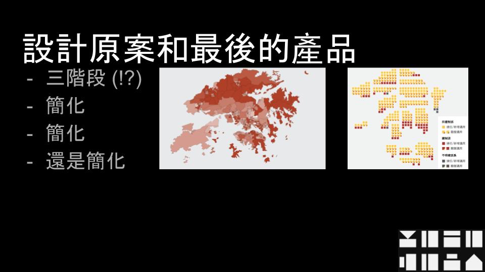
The plan was simple: Make a three-phase site for the three phases of the election — before the election, during the counting, and the final result.
The initial plan is to have slightly different features in the site and even different layouts in each phase. That idea quickly got dropped given the time limitation. So instead, we focused on the commonalities between all three phases, and built those as our minimal feature set.
Even with that feature set, we decided to set some of the features as “extended goals,” which eventually got dropped — so yes, what you see right now isn’t the full version of the site that we planned. Things like zoomable maps and candidate introductions were set to be the extended goals that we never got time to work on.
We also planned on making the map in higher fidelity — meaning that the map should actually look more like the actual map of Hong Kong instead of a pixelated chart. That idea also got cut for two reasons:
- The constituents of Hong Kong are not in equal sizes, which means there are some really tiny areas that would be hardly visible on an actual scale of map.
- Mapping out the borders of Hong Kong was simply too much work given the time that we had.
With this feature being cut, we also removed the requirement of matching the constituencies in the “map” according to its actual geographic locations. So the blocks you are seeing are supposed to be more dispersed. Instead of grouping all the blocks of the same color together, you will see blocks of different colors sitting next to each other. In retrospect, this small requirement change is eventually what made the chart easier to read and visualize the data better.
So, is the site 100% the way we planned and designed it to be? No. But does the site serve its purpose? I think so.
For reasons I mentioned above, the society’s focus on the election is not actually the candidate’s policy. It’s more about which camp is going to win. It’s probably not the healthiest demonstration of democracy, but it is how it was. The simplified version of the Hong Kong map effectively became a seat chart that allows our users to understand the current situation at a glance.
The Architecture

I’m not going to delve into the details of the implementation down to its lines of code, but I’m going to explain how we modeled the architecture of it.
The way we managed to deliver that many page views in one night, with just one tiny application server, is by making the site we serve a static one.
But it’s an election, right? There’s no way we can know about the results beforehand to prepare the data, and people who eagerly refreshed our site 20 millions times that night wouldn’t wait until we updated the site manually in the morning, after all votes were counted and results released.
So what we needed is a statically served site that can be updated in real time.
With the little budget and time we have, building a custom CMS for data entry wouldn’t be the most efficient way to use our time, not to mention we need extra hosting resources for the CMS site.
So what we did is to be as thrifty as we can. We used Google Sheet to build a custom form, which the Stand News editors will fill in with information and vote count numbers reported to them by the reporters standing by in the vote-counting stations.
Google Sheet offers a few ways you can do this. One is called the Google Sheet API that allows you to get a spreadsheet’s data via its RESTful API. You can also publish your spreadsheet and have it served as a JSON document. But as there are information that we show on the site that aren’t simple values on the spreadsheet, but rather data requiring come calculation, like the vote percentage and total votes received or seats won by a certain camp, we also used Google’s Google Script, which allows you to write JavaScript against the spreadsheet.
To make hosting the site even more cost-efficient, we had to be extra thrifty. Simply using the Google Sheet API would have been the easiest approach to deliver the data needed by the front end, but Google is not a charity, and using their API extensively can get expensive very quickly.
So, what we did is to write a program that accesses the endpoint in order to retrieve data from the spreadsheet at a certain adjustable interval, do some calculation to prepare the data we need, save it as a JSON document, then upload it to a Google Cloud Storage bucket.
By doing this, we made sure that the needs of computation will not grow along with the amount of visitors we receive. In fact, we will always only need one worker running every minute to create the data file the site needs.
The rest is quite straightforward — the front end is written in React.js, which is served as a static JS file, along with CSS and HTML. This simple structure comprised the front-end web application. The app itself does some very simple things when it’s loaded:
- Download the latest version of the data file from Google Cloud platform.
- Use the data within the downloaded JSON to render the site.
- Check if a new version of the data file is uploaded every once in a while.
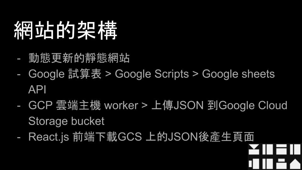
So that’s how we built a site that served so many page views with so little computing resources and at such a low cost — by not building a CMS and instead serving a static site that downloads the data file generated by a proxy worker that fetches data from the spreadsheet that the editors fill information in.
Why did people come to the site?
In retrospect, we never thought we would be getting so many page views and visitors that night, or that it would go viral for a short while.
Long story short, the pro-democracy camp won all the districts, and people were so excited about the news as the vote count unfolded. As people kept refreshing our competitors’ site, the word was that they got quite slow and unresponsive, so people started to look for alternatives. That’s how the site that we launched the latest got so much attention in the election.
Lessons and Takeaways
So, this is how we built the site and survived the traffic — but how is this related to our topic on social engagement?
To me, the biggest lesson I took away from working on this project is that contributing to society can happen when I sit behind a computer 1,000 kilometers away from my home. It can happen just by doing our jobs right and having other people in mind.
Like I said, no one told me that this website will be serving so many people that night. We even thought that people will be using other sites instead given our late launch. It was also a bit tough with the compromises we had to make given the time and budget limitations. In fact, that night, when I looked at the Google Analytics dashboard, the numbers I saw were a big surprise.
This is the message I’m trying to get across to all of you: As developers and professionals in the tech industry, we may not always be the first ones people think of when they talk about contributing to society. We may also not always know how many users will use our products. But that doesn’t change the fact that now, many parts of our society rely on computers and the programs that we write.
So, this is how we take part in our societies — not necessarily by going to the streets and preaching how to use the internet safely, or being a hacktivist — these are important ways to contribute. But it can also be as simple as being conscious and responsible when doing our job and remembering that we build things that will be used by other people — may it be an app to be intentionally used, or a service that’s implicitly called by the apps people are using.
Think more than just the tickets on your backlog. Think about the people you’re working with and the people who will be using your products — work for the people, not just to finish a task.


