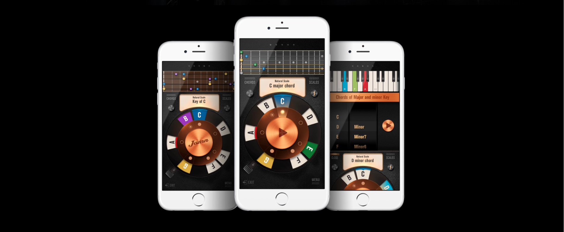
History is made of accidents and the history of technology is no exception. Many beloved services and digital products began as side projects that became moonshots and spin-offs. Fog Creek spun off Trello while Basecamp replaced its parent company, 37 Signals, (which also spun off Know Your Company). More recently, Unsplash was acquired by Dribble and split from Crew. The beauty of these side projects is they began as practical solutions for a problem that the development team could relate to without being weighed down by business models.
What gives our developers the greatest satisfaction is seeing others use our products — and even better when it’s our fellows! It’s one of the reasons our company gives team members the freedom to research and build ‘playground’ products in addition to client projects. We want to build tools for ourselves.
On the other hand, side projects can’t take too much time since we have client work. The MVP approach in one or two month sprints — from ideation to prototype — is a great way to think about a product holistically. A developer is always working on a side project part-time, so the goal with the MVP is to have a complete, usable product for ourselves. Our projects have included our open-source internet-of-things (IoT) company door lock that everyone uses daily; products like MockUPhone and MakeAppIcon that help other freelancers and developers; and Spentable, Apple’s Best New App of 2016. With Sans Sugar, we are documenting our process to help other developers.
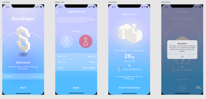
This blog covers the design, style and art direction of the Sans Sugar app that finishes with a mockup. Development preparation can happen in parallel to mockup designs so that technical implications and limitations can be factored in into the user interface/user experience (UI/UX) designs.
What’s Next After a Wireframe
Stages of App Design
Good design involves as much planning and research as it does actually creating the visuals. But the key to good design is having a clear process. Below is our process for app design:
- User Story: Capturing what a user would do in a product.
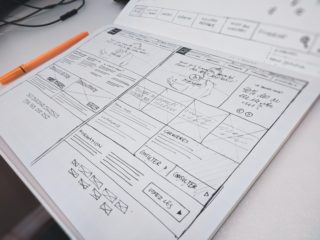
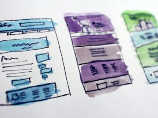
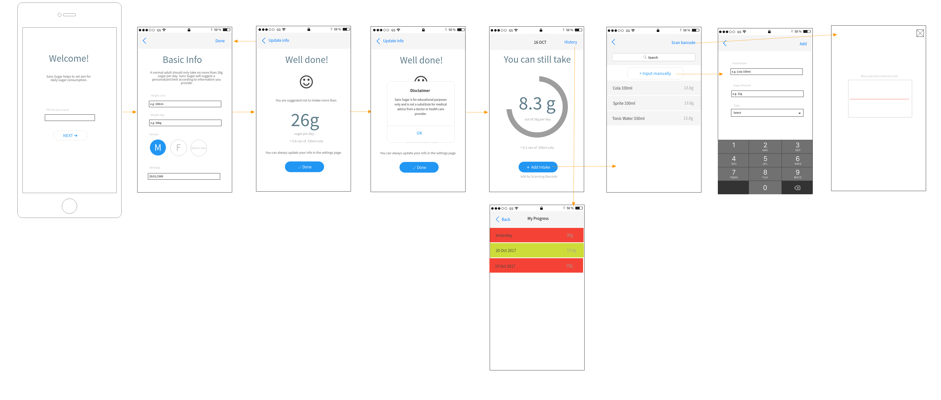
- Wireframes: Showing the screens for the apps to capture features previously discussed and the user flow — saves a lot of time when talking to a designer
- Style and Art Direction: Visual identity, look, or “feel” of a product.
- UI Elements and States: Interface components and designing for different states users encounter in an app.
- Mockups and Prototypes
Our blog, “What you don’t need for an MVP,” covers defining the problem, researching similar apps, and the first three versions of our wireframes. This article covers the remaining design work until the mockup and prototype phase.
For client projects, our sales team helps capture user stories and the designers to create the wireframes. However, since Oursky encourages T-shaped knowledge, many of our developers can read and create wireframes. For Sans Sugar, our lead developer was also the project manager (PM), so he created the user story and wireframes to speed up the design process.
Design considerations that later get reflected in mockups are outlined below.
Things to Give a Designer to Create a Mockup
Projects have designated PMs, developers, and designers. For internal side projects, our PMs prepare the wireframes and brief the designer so they can dive right into the mockups. For our design clients, our design team will also prepare the wireframe where appropriate.
After understanding the purpose and features of the app, the designer will think about the style and art direction when creating a visual identity. Will the approach be a flat design? Does the app have specific color branding? By the time designers start doing mockups, they should already have the following (whether created by themselves or provided by collaborators):
- A project brief explaining what the product is meant to do and the user background (i.e., designing for the elderly or color blind)
- A wireframe that they usually create for clients
- Brand guidelines and requirements, if applicable, so the designer can factor this in early on
- Example web/mobile designs they like (Dribbble is a great place to start for inspiration)
We also suggest:
- Giving designers creative space and understanding that the designs you have given are references
- Following Apple’s Human Interface Guidelines and best practices for designing for the iPhone X for iOS-first MVPs like ours. Apple’s guidelines provide clear principles behind the UI/UX, such as how to approach data entry rather than just arbitrarily choosing drop-down menus as opposed to radio buttons; Android apps can check Google’s Material Design materials
Design V1
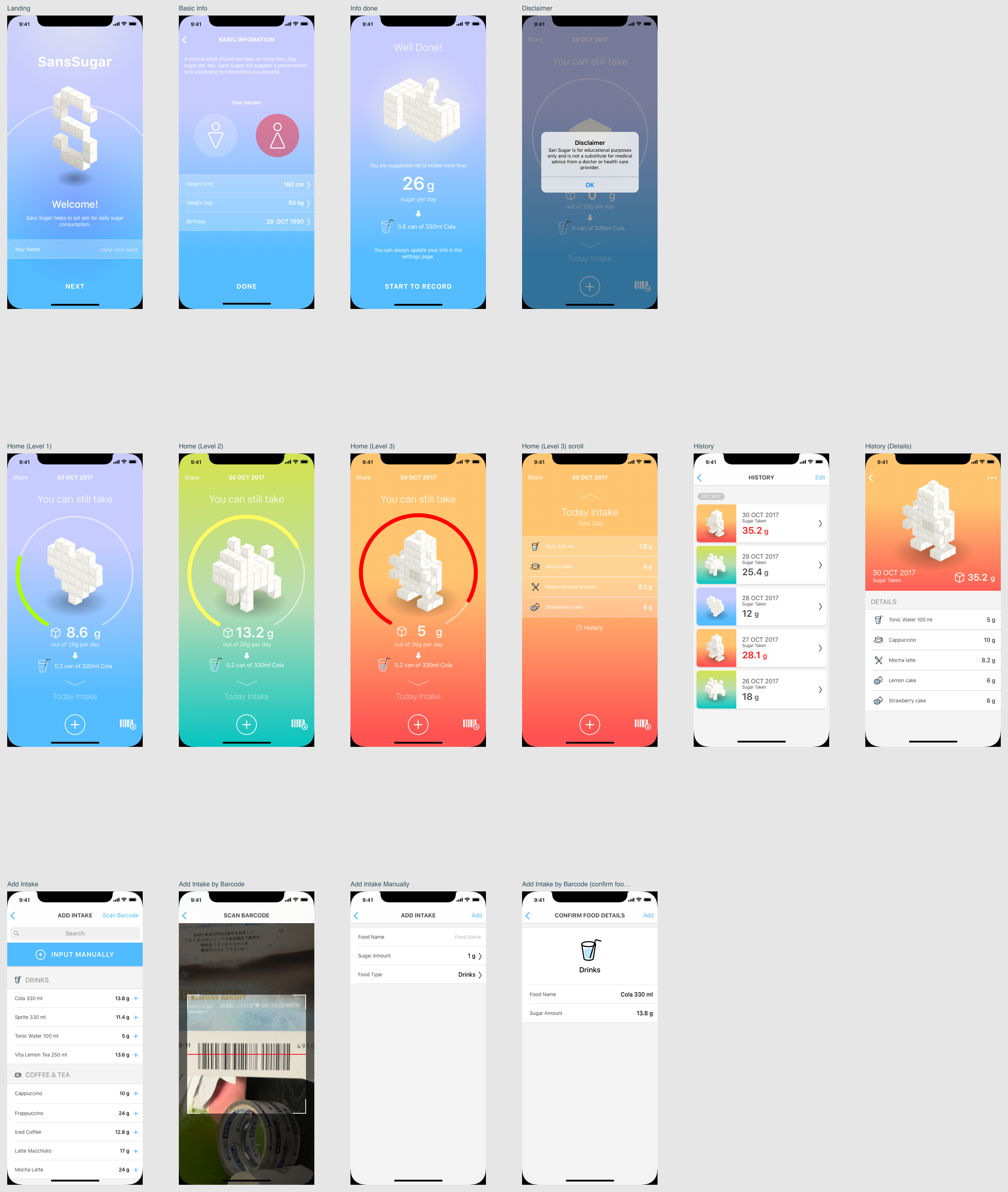
The above is the first set of mockups from our designer. Our one request for design was that the UI looked more native to reduce the amount of frontend coding for visuals and styling. The designer took this into consideration with the third row of mockups, which are mostly white and looks similar to Apple’s native UI.
Our designer used a gradient animator to play around with colors in order to make the app stand out visually while maintaining simplicity. We also adhered to Apple’s recommendations for the new iPhone X UI with the notch (check out other iPhone X UX/UI design tips here).
Notice that we also added different figures for the various amounts of sugar. These visual details can be fun to design and add character to an app, but always consider how they will actually be incorporated. In our case, these pictures of a heart, dog, and robot could be created as static images that load or dynamic blocks based on an algorithm that assembles them together. We ended up designing them as image assets to save development time, but more on that later.
Having the designer and developers working closely together allows us to have discussions about feasibility and execution early on so there are no major mistakes after development starts.
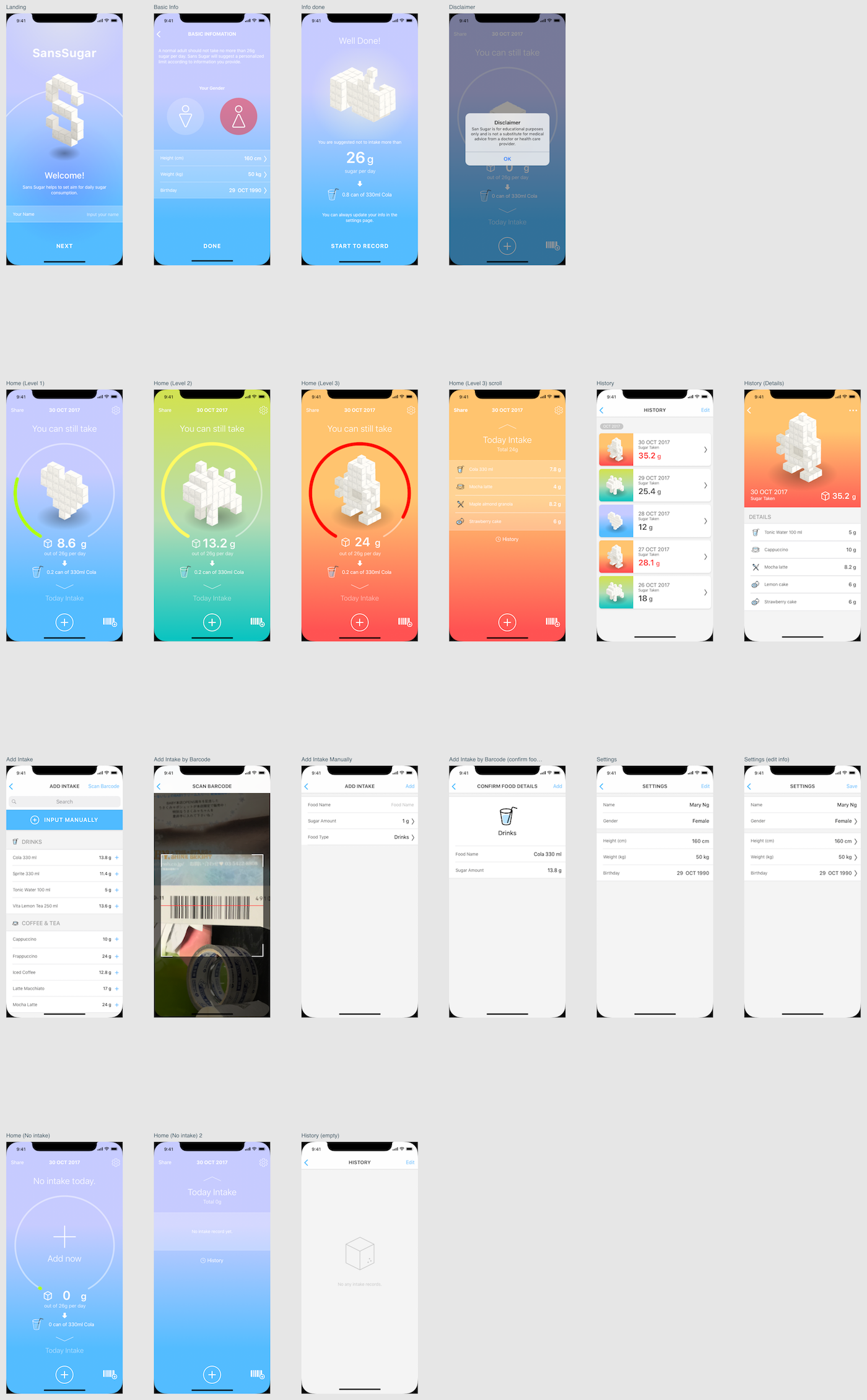
After our team agreed on the general design direction, our designer could create the remaining pages and fine-tune details. In version 2, our designer added states to complete the design and we’ll discuss the importance below.
Design V2: Adding All the Details
User Interface Elements
When designing your UI, try to be consistent and predictable in your choice of interface elements. Requests for “detail” changes can make a huge impact on how intuitive the app’s UX is. Try to use elements that consumers are used to and have predictable behaviors to help with task completion, efficiency, and satisfaction.
Interface elements can include:
- Input Controls, such as buttons, dropdown lists, checkboxes, text fields, etc.
- Navigational Components: such as icons, pagination, slider, breadcrumb, etc.
- Informational Components, such as icons, notifications, message boxes, etc.
- Containers, such as accordion
User Interface States
We are creating whole products rather than isolated pages, so the design phase is also good for adding in previously missed states in the wireframe period (e.g., empty states, incorrect or error states, or completed states). Check this piece about the 9 user interface states.
Because we used Sketch for our mockups, we can also export slices that are more convenient for our developers to create the front end of the app.
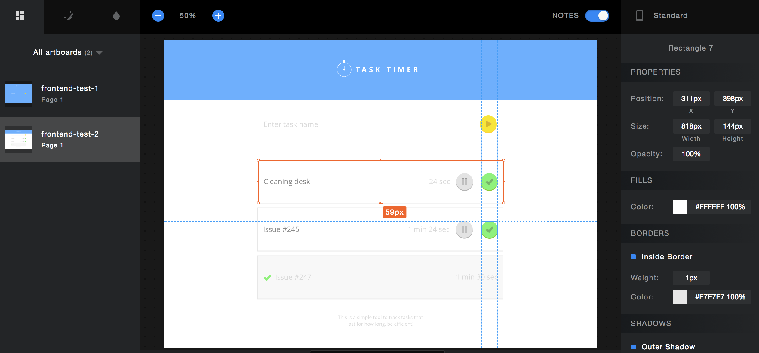
Where appropriate, our design team also creates style guides to give developers and future designers reference for consistency.
Designing Ahead
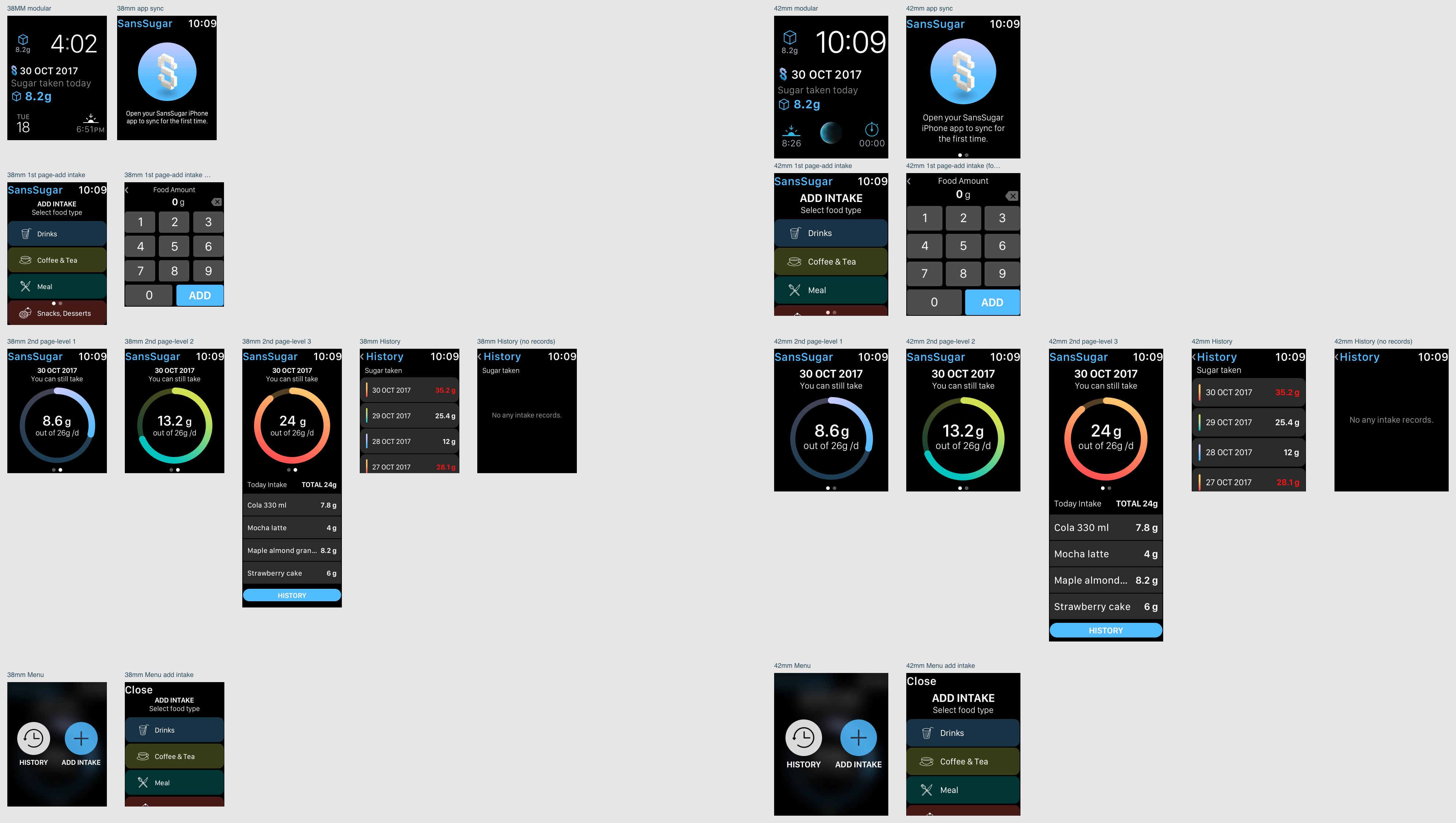
Even though we aren’t making the Apple Watch app yet, it is a logical next step if the MVP does well. Our designer took the extra step to start playing around with the Apple Watch designs. Next up, we’ll explain the research and prep work that developers can do to design a good app architecture.
This is Part 2 of our iOS MVP design and development series for our side project, Sans Sugar, a simple tracker for your daily sugar intake. Check out Part 1: what you don’t need for an MVP!
If you found this piece helpful, subscribe to our newsletter for more startup, entrepreneurship, project management, app development, and design hacks! 👏
😻 At Oursky, we’re all about helping brands and entrepreneurs make their ideas happen. Get in touch if you’re looking for a partner to help build your next digital product.

