In addition to our reputation for clean and sturdy code, Oursky is known for our thorough design process that produces products such as Cococolor and Artstack. In this post, we’re annotating our internal web design guideline document for you to use.
We’ve refined this process of the years and going on our ‘don’t repeat yourself’ rule, we’d love to share our process transparently with you. These web design best practices are applicable for client and in-house products. Below, we’ll show you the web design for Skygear‘s sign up web portal (try our BaaS for free!). to show you how we do things in-house.
Things to know beforehand:
Tools of Choice: Adobe Illustrator and Sketch
This post is our web design deliverables and process for clients. This means we’ve taken our usual checklist and added an example of the things we create.
This design work is done before development starts using information gathered from the user stories we collect from potential clients. The format of the stories can vary, but generally we have a product summary sentence and the things users want to do (i.e. sentences such as “Create an account with my mobile number.”) so various aspects of design will not be finalised until around the kick-off meeting with development (such as typeface, logos, button customisation).
Below you can copy our guideline below and adapt it for your own team and clients!
Our Work Flow
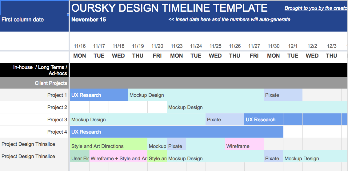
We count in working days. The process identified below means 10-20 working days, which translates to 1-2 months assuming we also get client feedback immediately.
Sitemap [1-3 days]
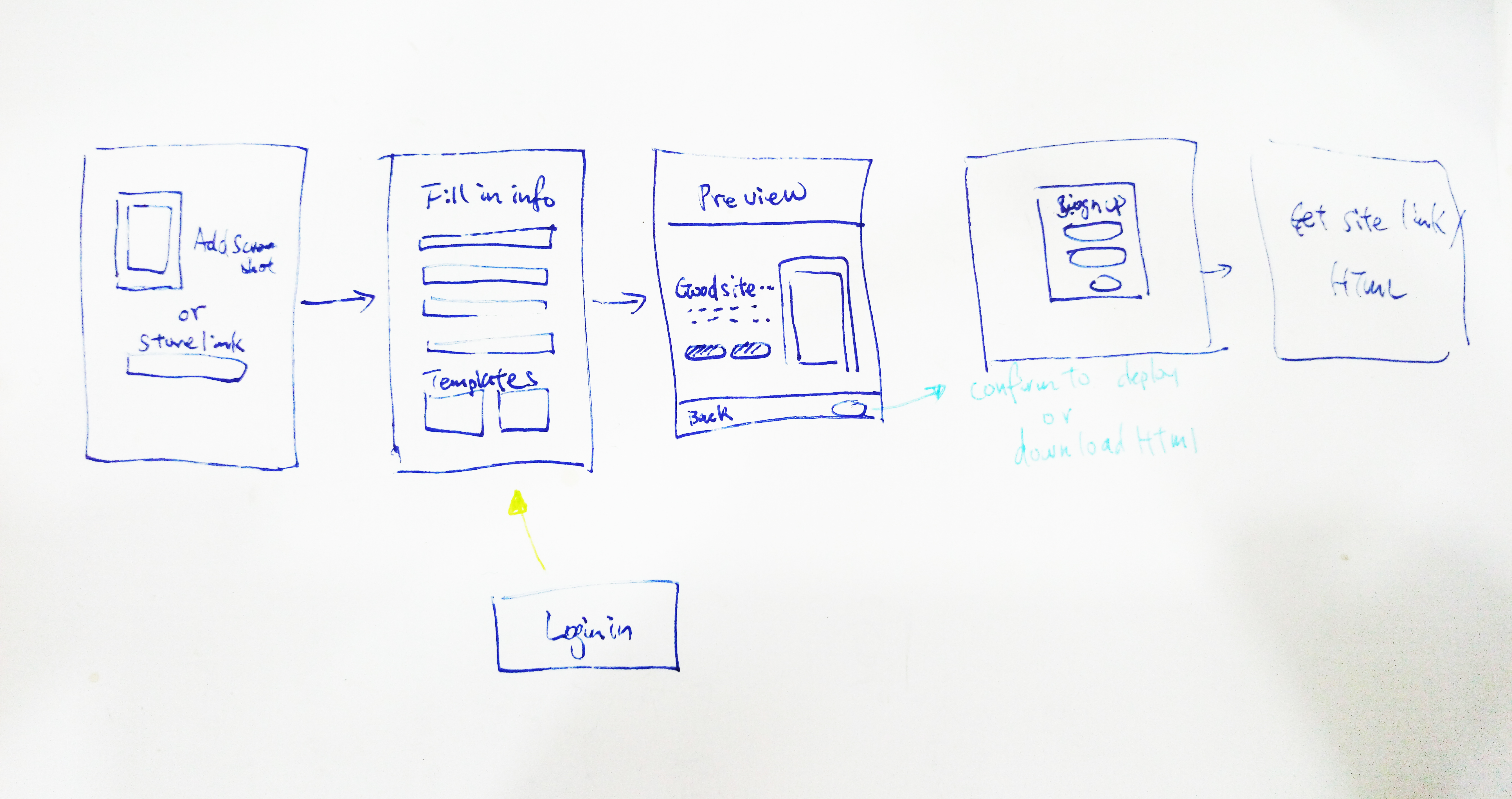
- Synthesize the product specs.
- Conceptualise the main pages for a website.
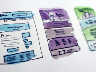
Our process usually begins analogue because we have rooms and whiteboards that we can brainstorm with. After the initial drawings, we create an initial map using some stock blocks.
Tools of Choice: Adobe Illustrator (US$29.99/mo)/ Sketch (US$99) / Google Draw (Free)
Basic Wireframe [1-5 days]
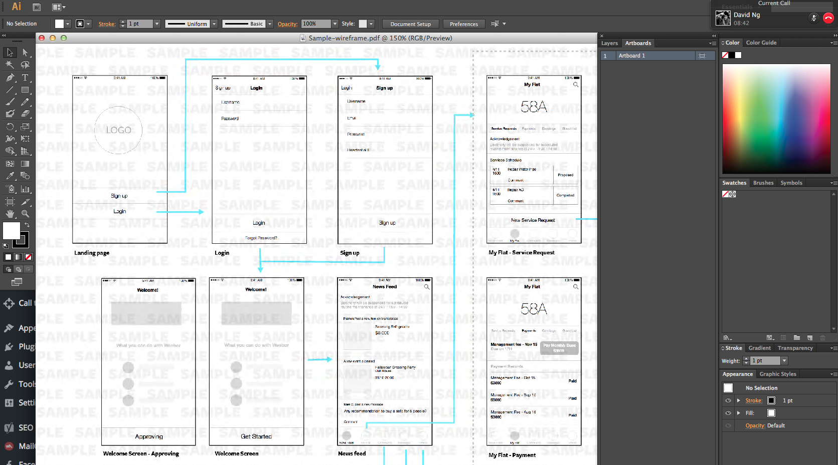
- Draft the sections and components in the sitemap.
- Each page should have a clear and consistent layout.
- Pay special attention to spacing.
- Figure out site navigation.
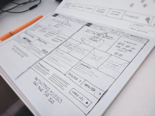
For us, the basic wireframe still starts clean. We use greyscale in order to focus on the key components in the design and navigation to discuss with the client. Instead, we pay extra attention to detail for laying out the flow in a clean, but understandable way (note the aligned panels, and that arrows are coloured to help guide the eye. We prove our design competence early on by paying attention to details such as arrow placement and alignment.
Tools of Choice: Sketch (US$99)
Style and Art Direction [1-5 days]
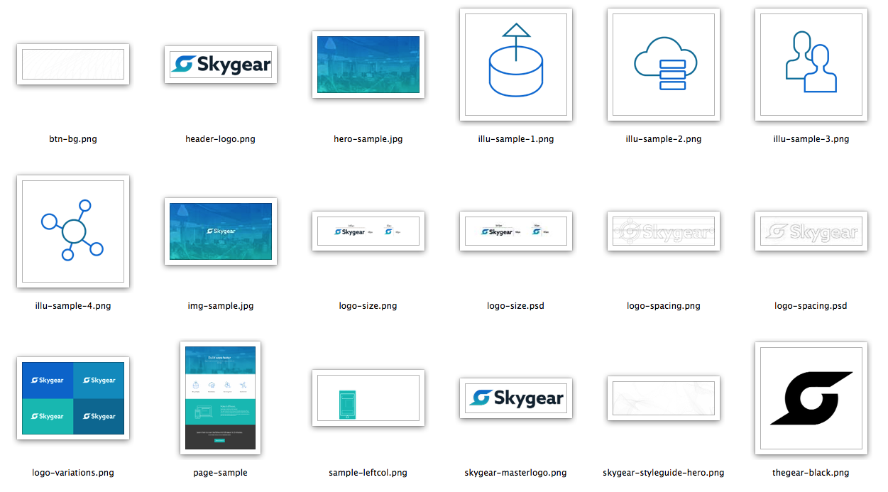
- Present the wireframe concept to the client.
- Clearly define the Style and Art Direction with Client.
If you think you know colour, think again. We spend a lot of time thinking about what ideas we want to convey with colours and ensuring they are are cohesive with our buttons, icons, and other assets.
Prepare beforehand:
- Colour palettes
- Images that suit the style previously discussed with the client
Tools of Choice: Adobe Illustrator (US$29.99/month) / “sketches on paper” / Sketch (US$99)
Website Mockups [1-2 weeks]

- Based on art direction decisions with the client.
- Take wireframe and design site mockups
With the colour palettes mostly defined, we put them to test with our mockups. Not all mockups need to be high fidelity, so pick your battles. You want to convey the user flow in a self-explanatory way to the client while saving time. Even if you charge per day, best practice is to finish as early as possible, save the client from unnecessary spenditure, and have them return in the future.
Files to be generated:
- Icons (square, long, black and white, etc.)
- Colour palettes
Tools of Choice: Sketch (US$99), Adobe Photoshop (US$29.99/month), Adobe Illustrator (US$29.99/month)
UI elements and states [1-2 days]
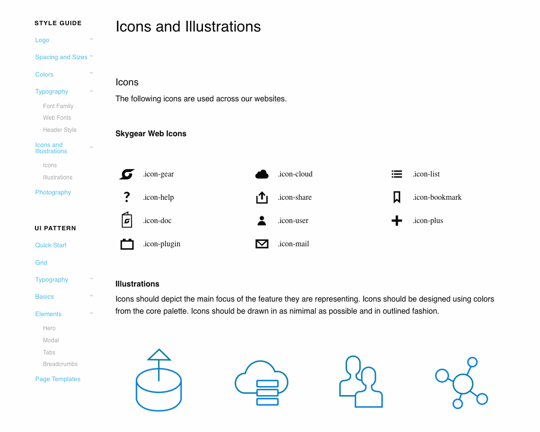
- Button States
- Forms
- Depending on navigation complexity, an animated demo or a basic clickable prototype may be suitable.
The devil is in the details. For inspiration, many free UI elements kits are available now. They’re a great place to start, but if you want to stand out as a development team, you need to put your own stamp on the product. At Oursky, we usually do our designs and mockups in-house (i.e. we don’t take kits and templates) even though we always look at new portfolios and content. For inspiration, you can check the plugin Muz.li.
Tools of Choice: Sketch (US$99), Invision (Free)
Kick off meeting with Dev [1 Hr]

The final stage is to present the design to the development team after receiving client approval, which should be quite smooth since we involve or clients throughout the process.
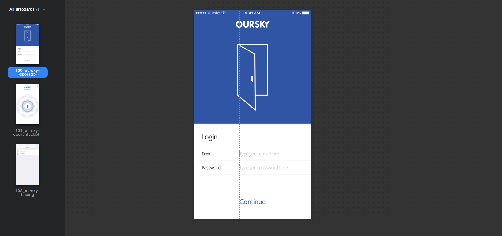
Tools of Choice: Sketch (US$99) + Sketch Plugin “Measure”
Things to discuss include: Website flow / UI states / Any outstanding items
The files we provided for this post are from our open-source BaaS service, Skygear.io, which you can try for free!
If you find this post interesting, subscribe to our newsletter to get notified about our future posts!



2 comments
Thanks for sharing a great post about web design process. Before designing the website, it is important to pay attention to all these topics. Knowing these topics will make it easier to design website. It is good that you have focused on time-duration of web design process.
This is very generous of you guys 🙂 Wireframing is the best! Like you said in one of your other posts – it shows your client that you are competent of doing the job!